
Brand Strategy & Visual Identity
Translating Brand Strategy into Scalable Visual DNA for the Creative Economy
I see a brand's identity as a living system. My focus is on creating cohesive, welcoming brand ecosystems that move beyond static design to translate high-level business strategy into enduring visual narratives. By establishing a brand's unique Visual DNA—an integrated language of typography, color theory, and digital architecture—I ensure a clear, consistent, and resonant presence across every touchpoint.
Balancing a thoughtful, minimalist aesthetic with clean operational discipline, I partner with both global enterprises and independent creative spaces to lead the complete brand lifecycle. Whether translating my design sensibilities into editorial assets for iconic brands like Sonos and AT&T, or crafting intimate digital stories for visionaries like BZIPPY, Sword+Fern, and Wonder Mountain Open Source Space, my commitment remains the same: elevating the public presence of artists and creative entrepreneurs through deeply considered, sophisticated design execution.
Key Expertise:
Brand Architecture & Positioning Strategy, Holistic Identity Creation, Typography, Scalable Digital & Social-First Asset Design, Brand Architecture, & End-to-End Graphic Systems & Guidelines.
Case Study 1: BZIPPY | Brand Identity & Workshop Launch
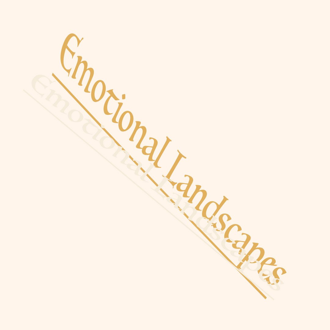
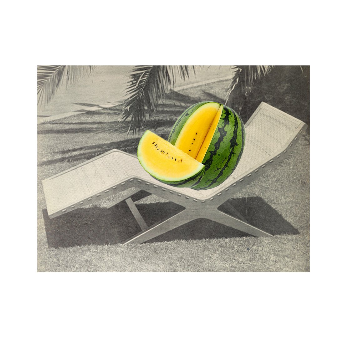
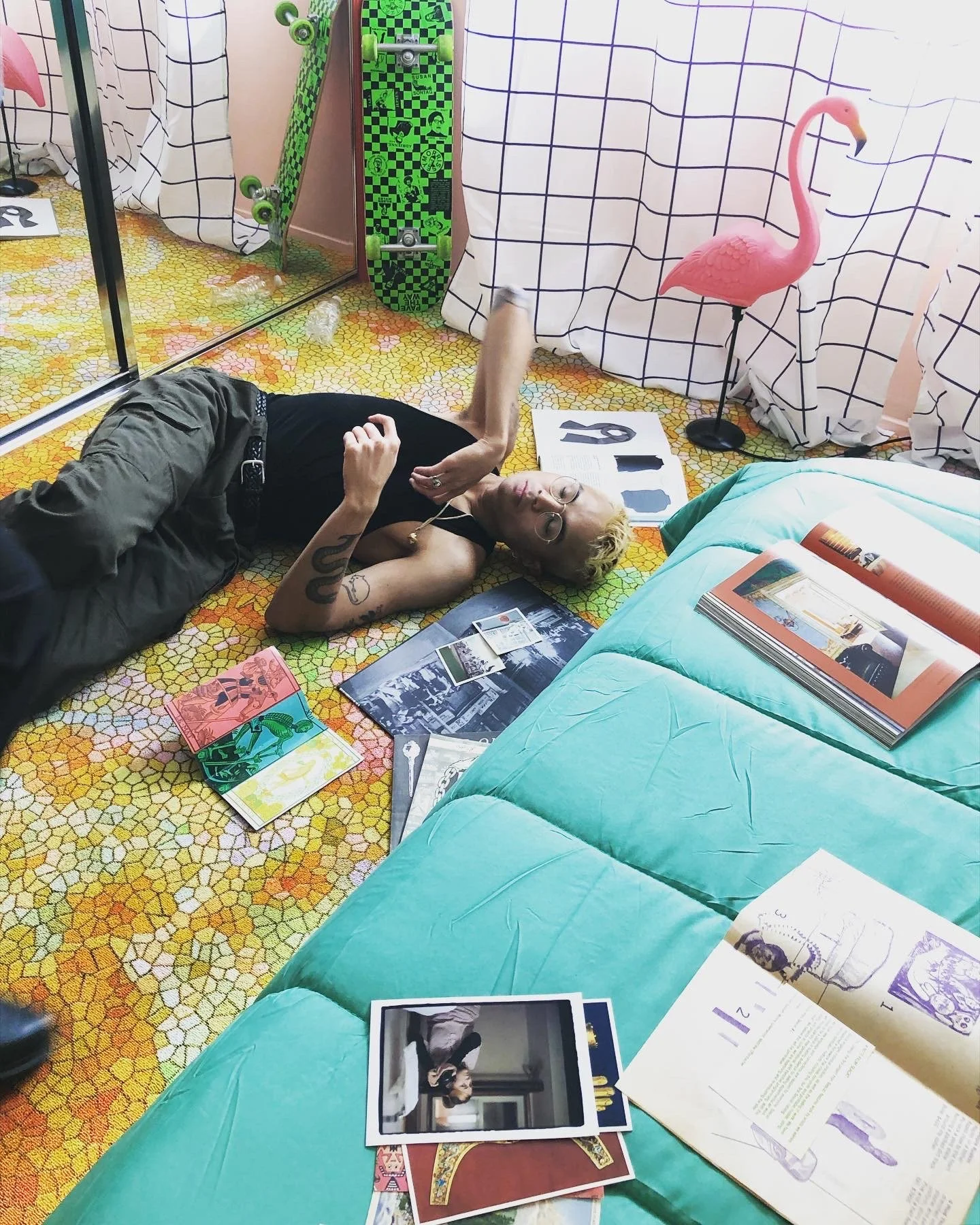
Strategic Focus: Translating the physical aesthetic of an internationally recognized, high-end production ceramic studio into an accessible, community-focused digital campaign.
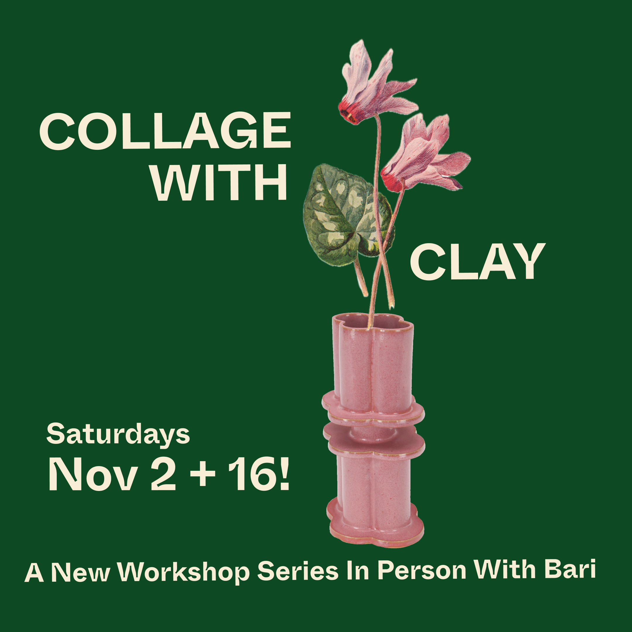
The Work: Led the comprehensive marketing strategy and graphic identity for the primary brand and its local community initiatives, prioritizing a cohesive, professional visual standard that expanded the studio’s reach into experiential marketing. A cornerstone of this role was the end-to-end creative conceptualization and design for the studio's inaugural in-person public workshop series in Los Angeles, Collage with Clay.
Execution: Managed the structural layout design, digital marketing asset scaling, and promotional storytelling—from social-first digital assets to internal studio materials. By developing a distinct graphic language and establishing clear typographical hierarchies, this work preserved core brand values while building a high-demand sub-brand that drove immediate engagement within the Los Angeles art and design community.




Case Study 2: Wonder Mountain Open Source Space | Creative Residency Identity
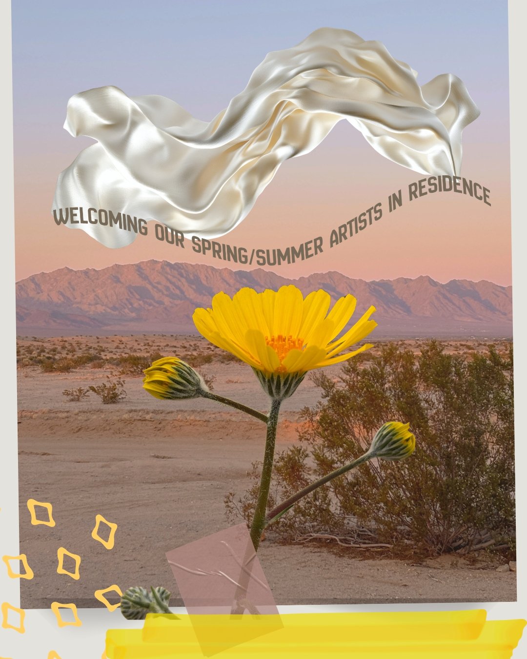
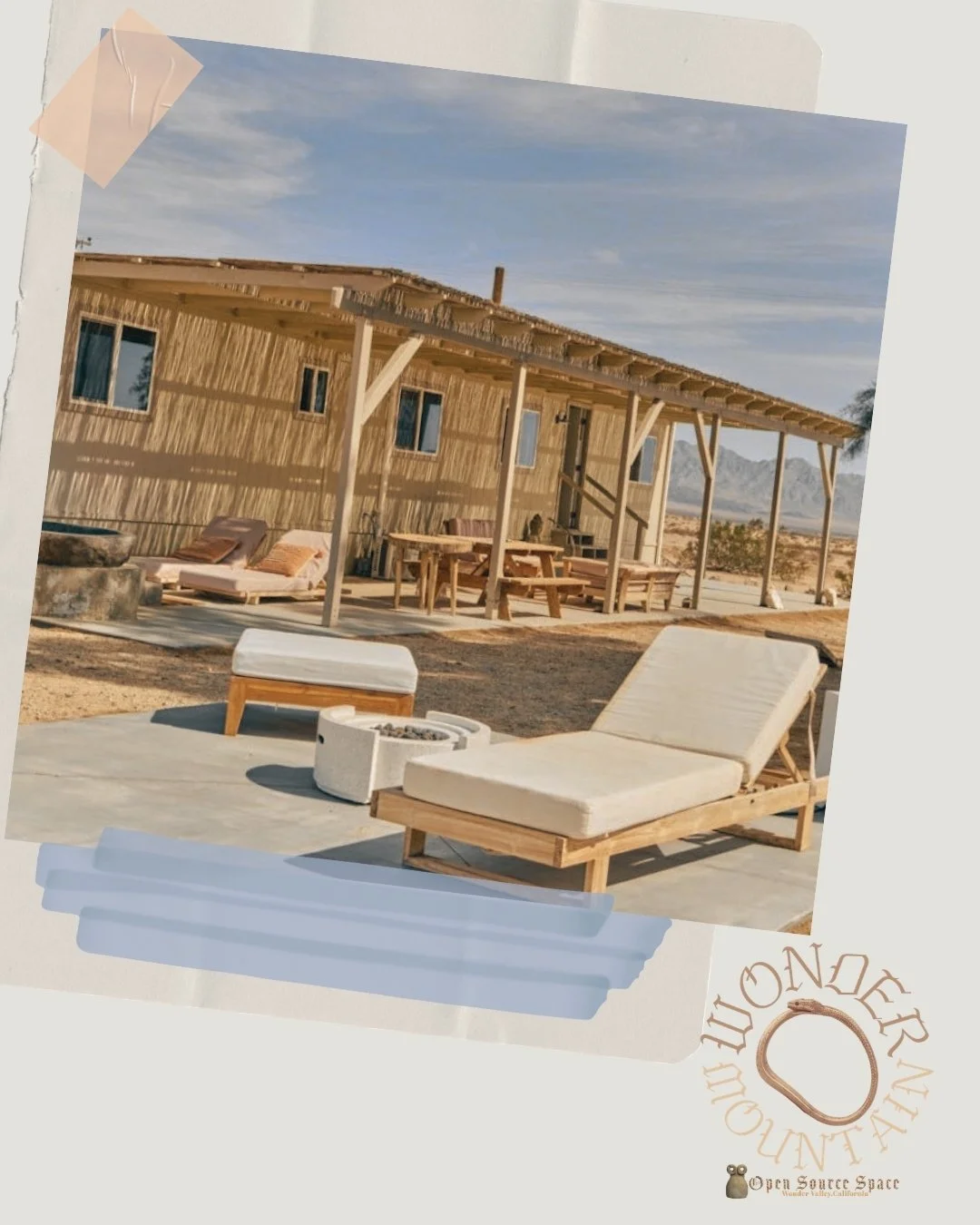
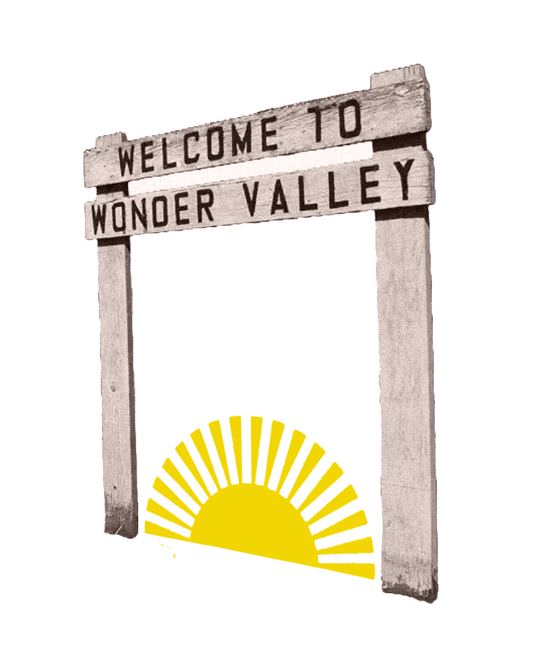
Strategic Focus: Developing a modern, minimalist brand framework and a flexible Living Identity for a desert-based creative sanctuary, explicitly centering the visual narrative around queer and BIPOC artist residency programs.
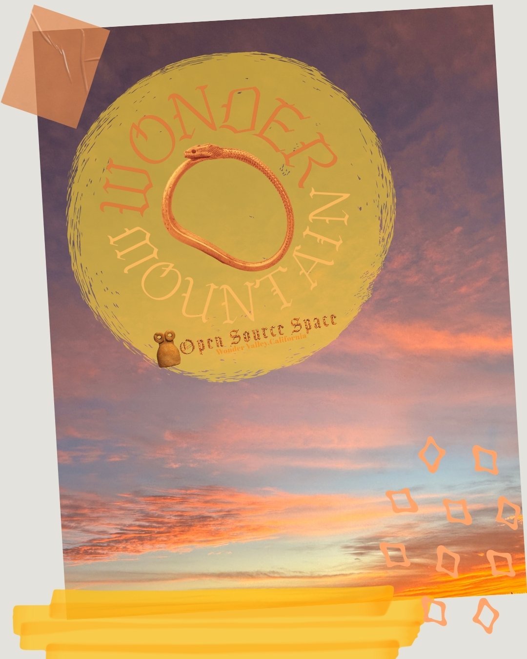
The Work: Conceptualized and executed the comprehensive graphic framework and visual identity, creating a unique brand mark and digital system designed to reflect the expansive, open-ended nature of the desert landscape. The branding elevates the raw, physical environment into a clean, contemporary layout that deliberately infuses a sense of creativity, inclusivity, and open-source collaboration into a professional, non-profit framework. Earning early critical recognition for its visual presence and community mission, the residency's program and design framework were featured in Poets & Writers Magazine.
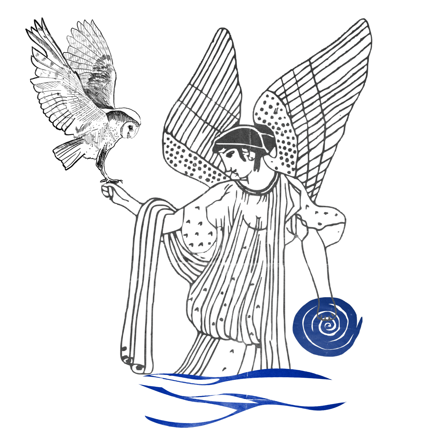
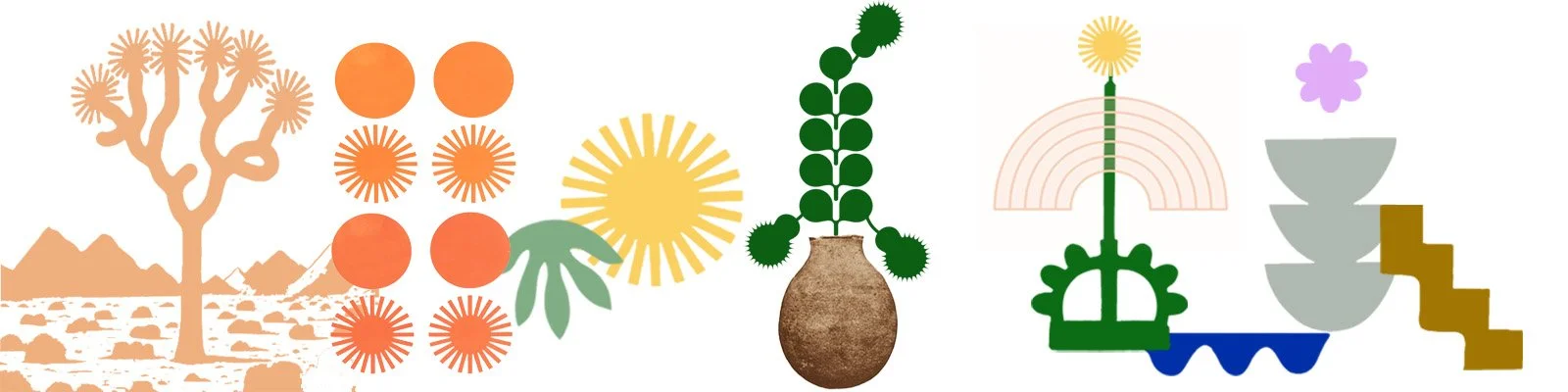
Execution: Designed an end-to-end brand book and digital architecture balancing stark, desert-inspired spatial elements with practical asset guidelines. The visual ecosystem features custom linework illustration sets, a symbolic ouroboros emblem, sun imagery, and abstract vector assets arranged alongside clean, minimalist graphic badges. This composition balances a refined, minimalist natural energy with a vibrant, playful undertone, ensuring the design framework feels deeply inclusive while seamlessly showcasing diverse artist works across website platforms and donor-facing materials.






Case Study 3: Sword+Fern | Holistic Brand Architecture & Identity
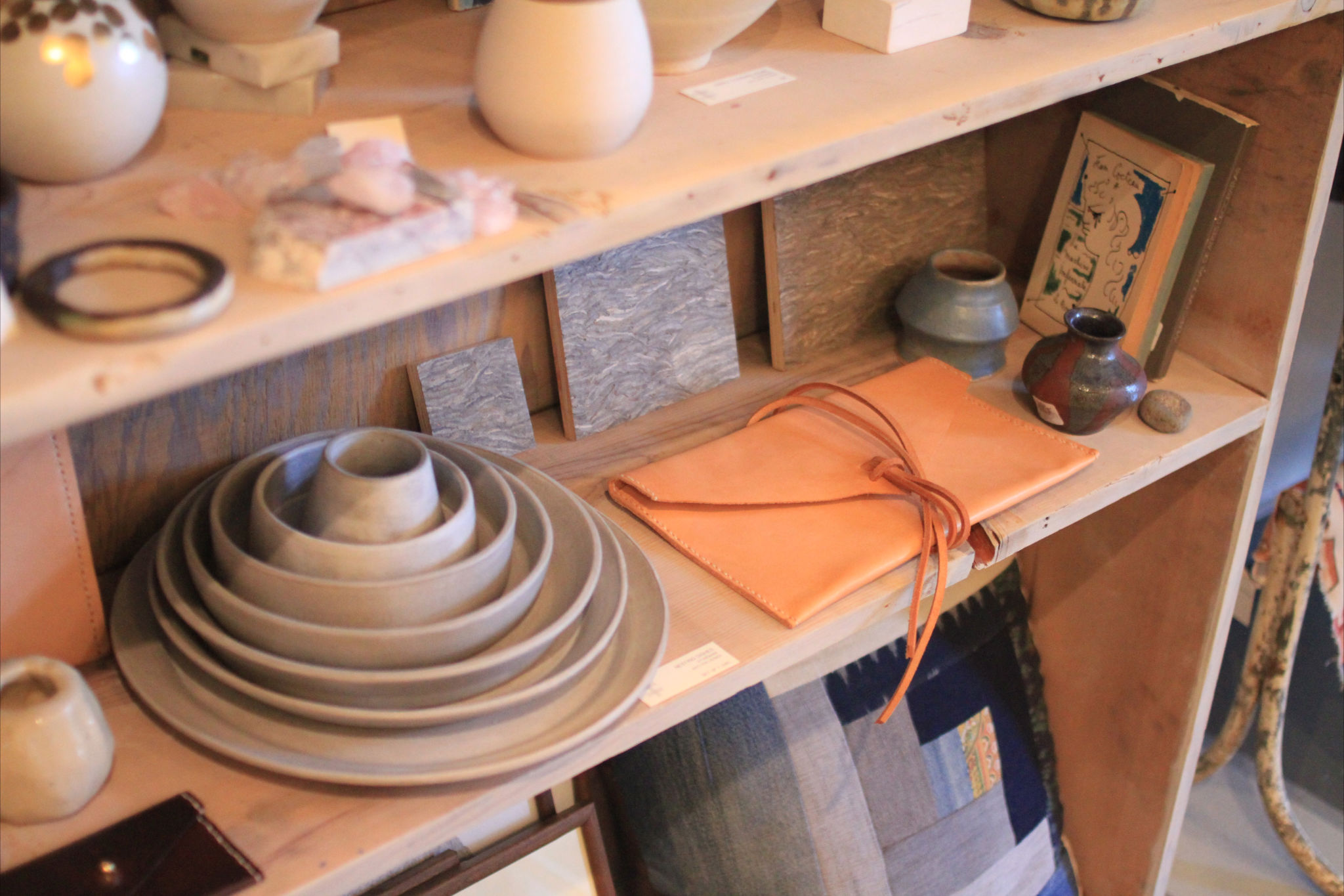
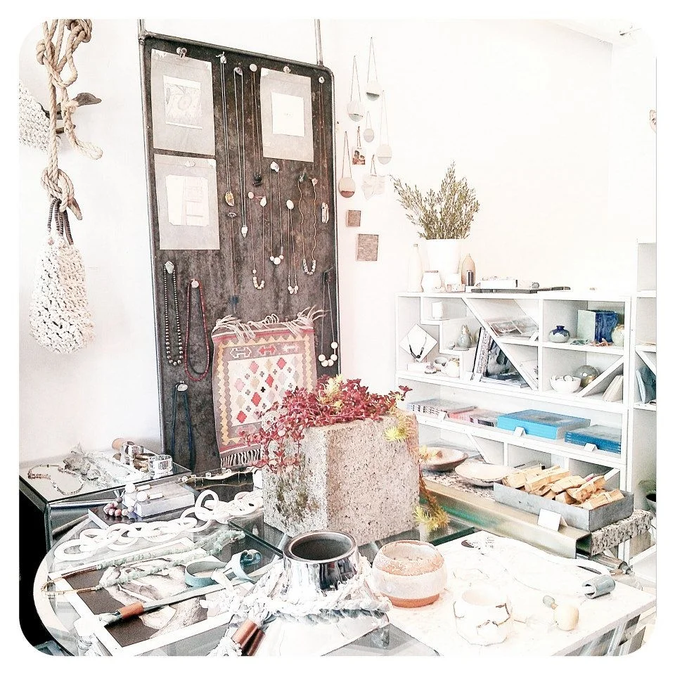
Strategic Focus: Evolving a multi-dimensional brand identity over fifteen years to position a sustainable jewelry line, creative studio, and retail destination as a pioneer in the urban apothecary movement.
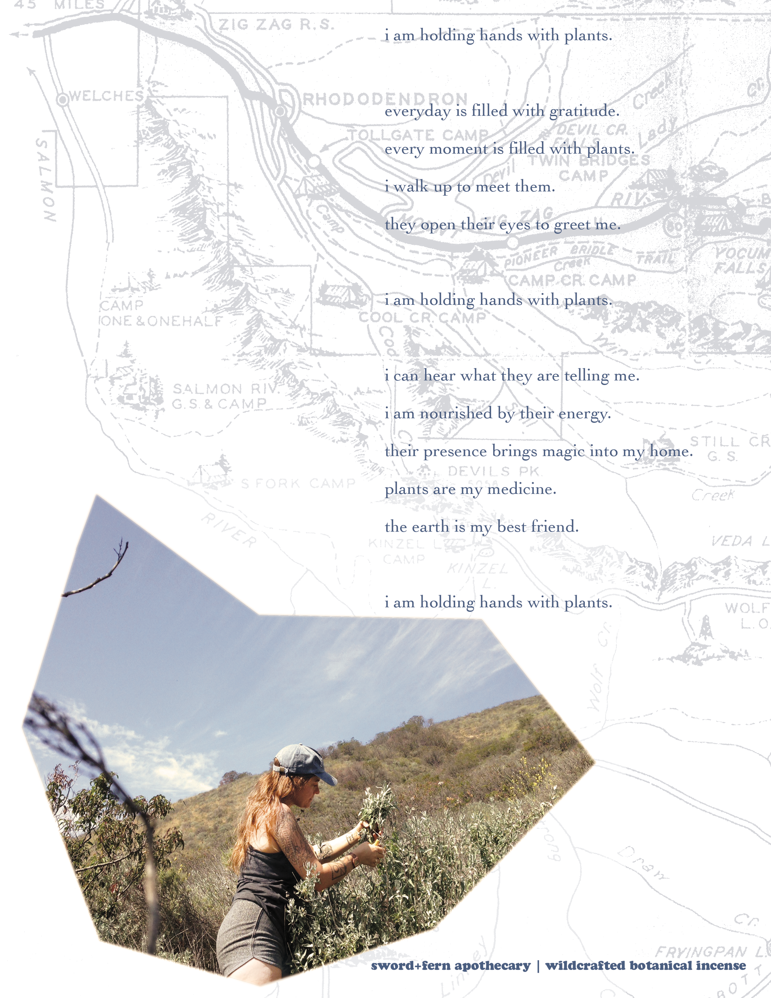
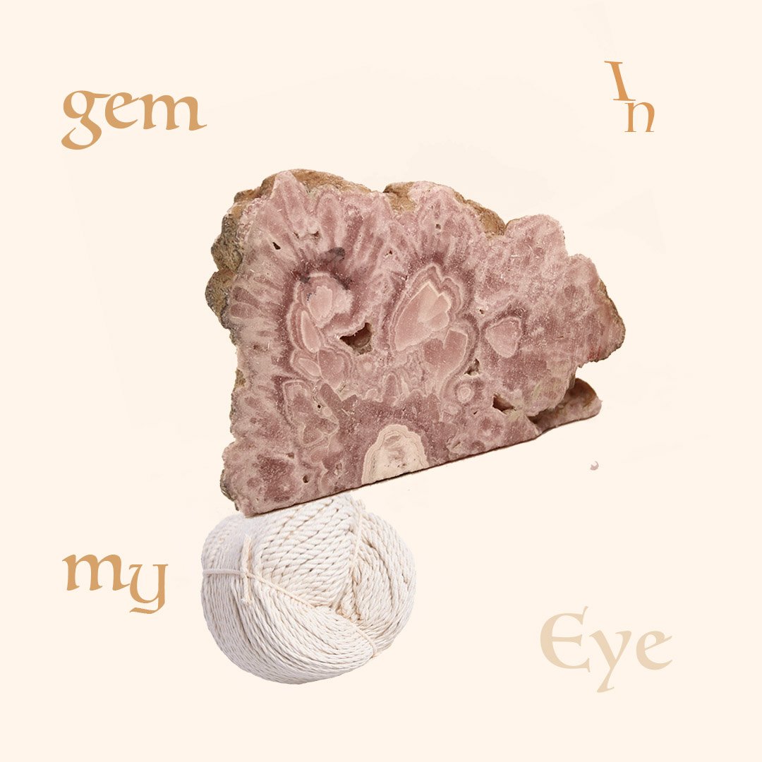
The Work: Directed the end-to-end brand evolution and visual marketing strategy, serving as an early adopter of the clean, plant-forward design language that came to define modern wellness. I directed the total brand evolution of Sword+Fern, a sustainable jewelry line and community hub that functioned as both an artist’s studio and a retail brick-and-mortar apothecary. I led the design of all digital and physical touchpoints, from the e-commerce interface to social marketing campaigns. By utilizing botanical and mythological motifs, I built a cohesive visual world that felt both ancient and modern, establishing a genderless aesthetic that resonated with a global audience.
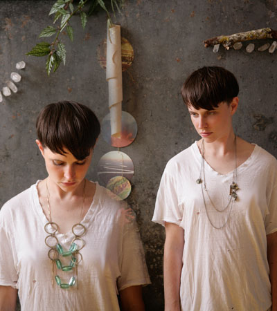
I scaled the Sword+Fern identity from a boutique studio in Portland, Oregon, to a widely recognized brand featured in The New York Times, Refinery29, ELLE Japan, and Nylon. I developed the brand’s visual narrative to a level that attracted partnerships with major retailers and national advertisers; the collections were featured in global ad campaigns for Levi’s and Frye Boots, and were carried by retailers including Anthropologie and Alternative Apparel.
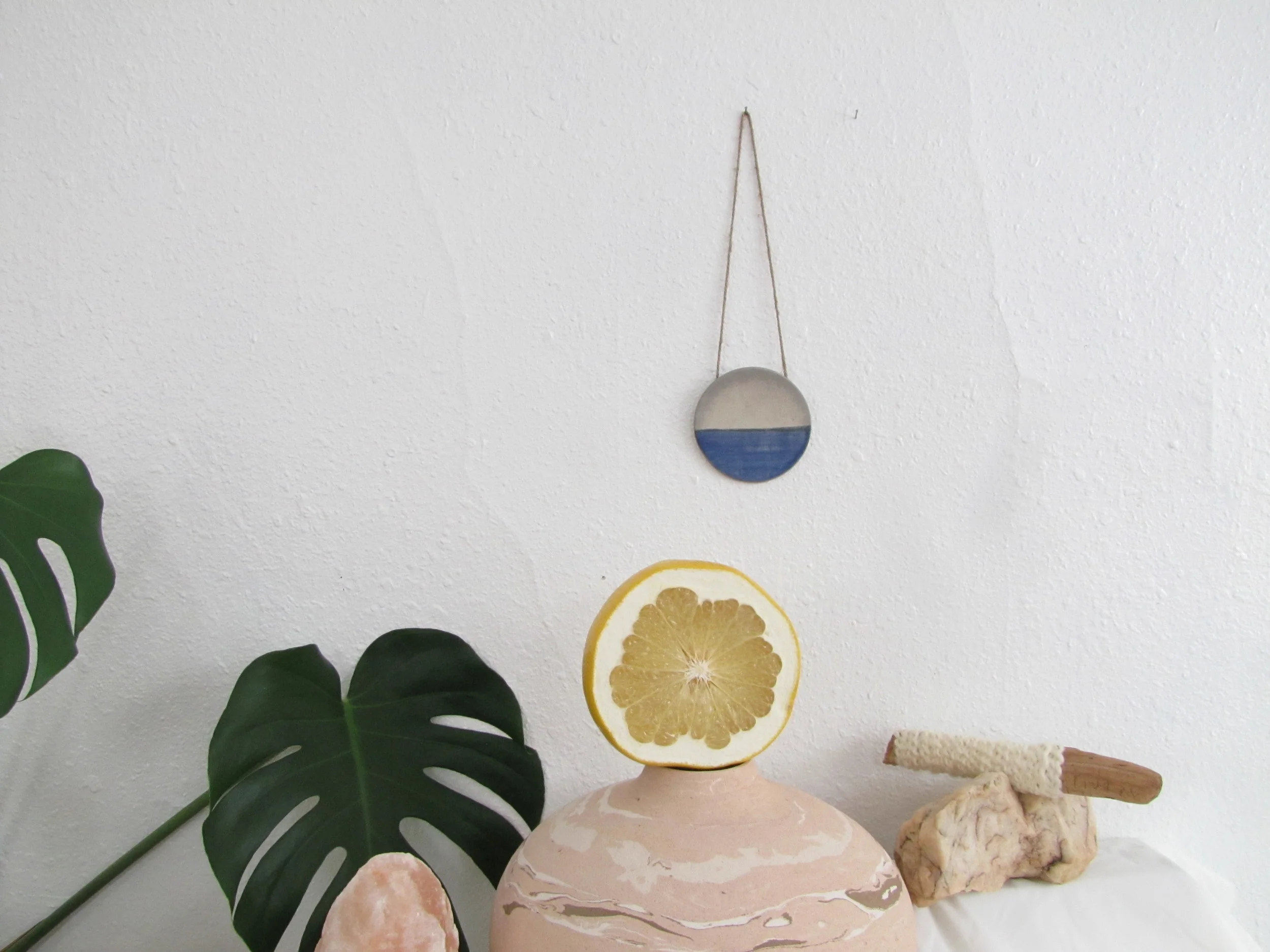
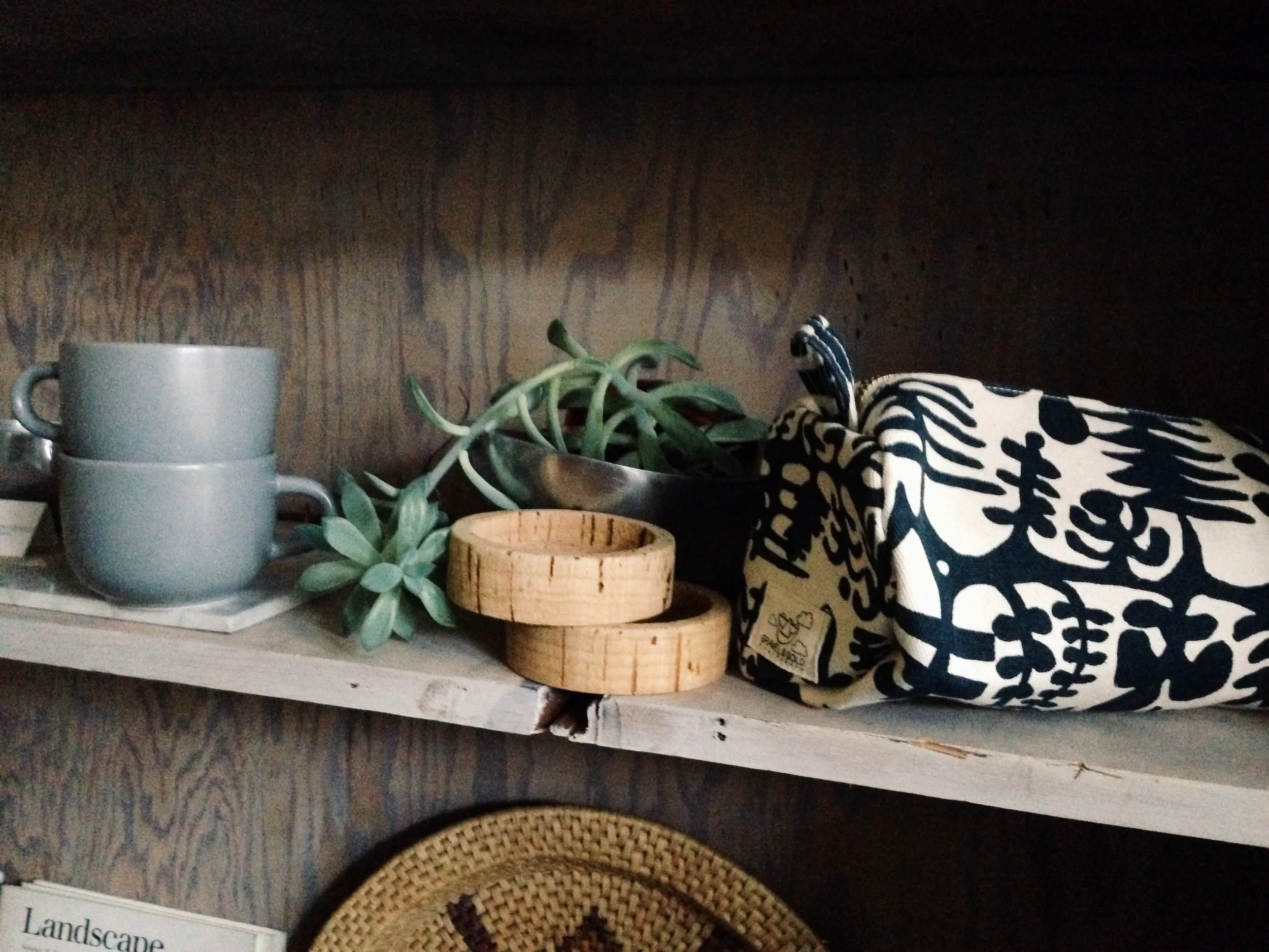
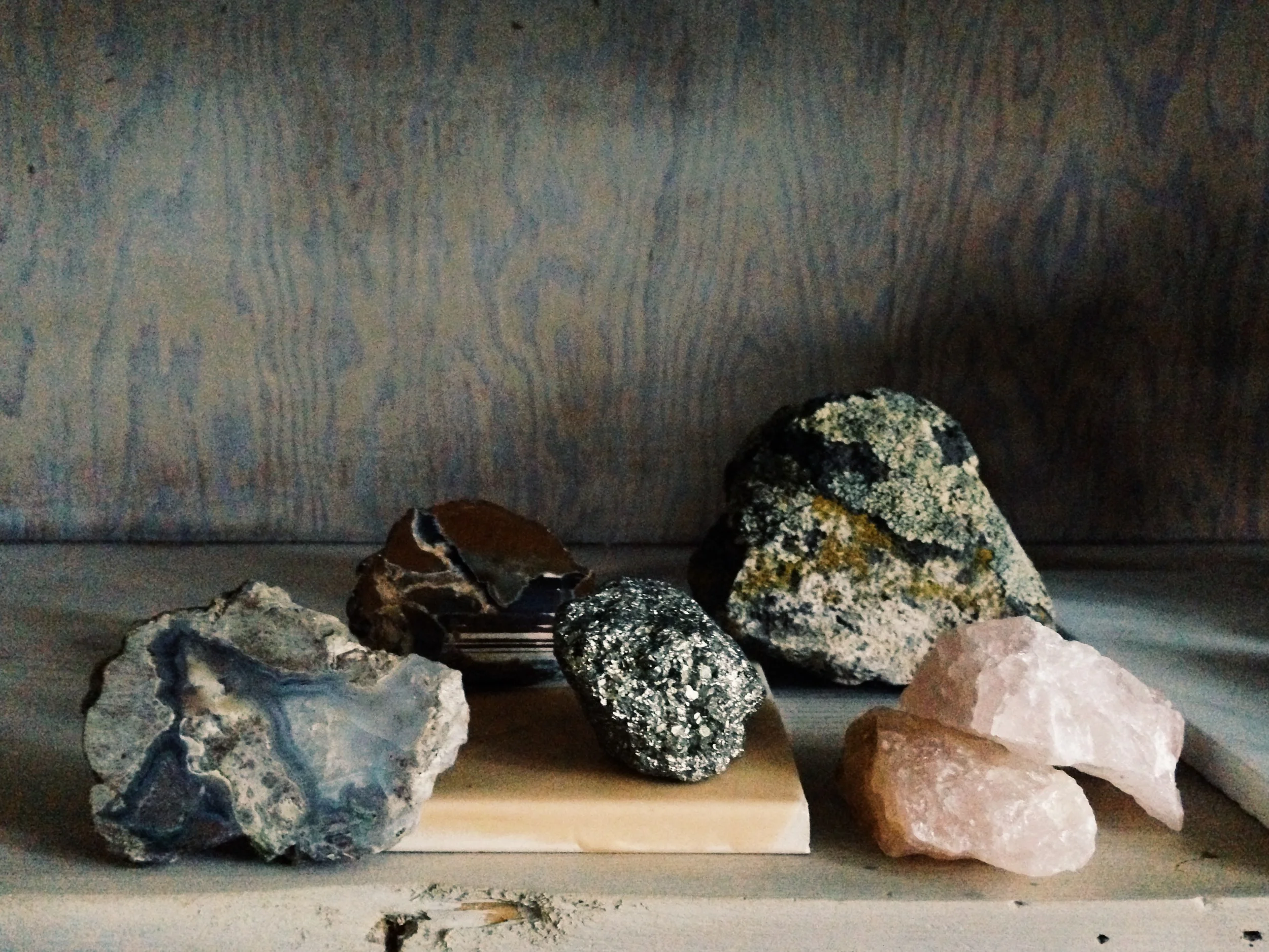
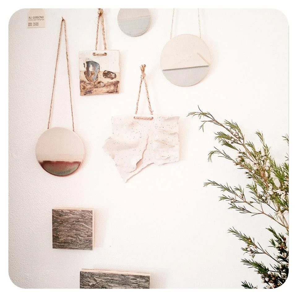
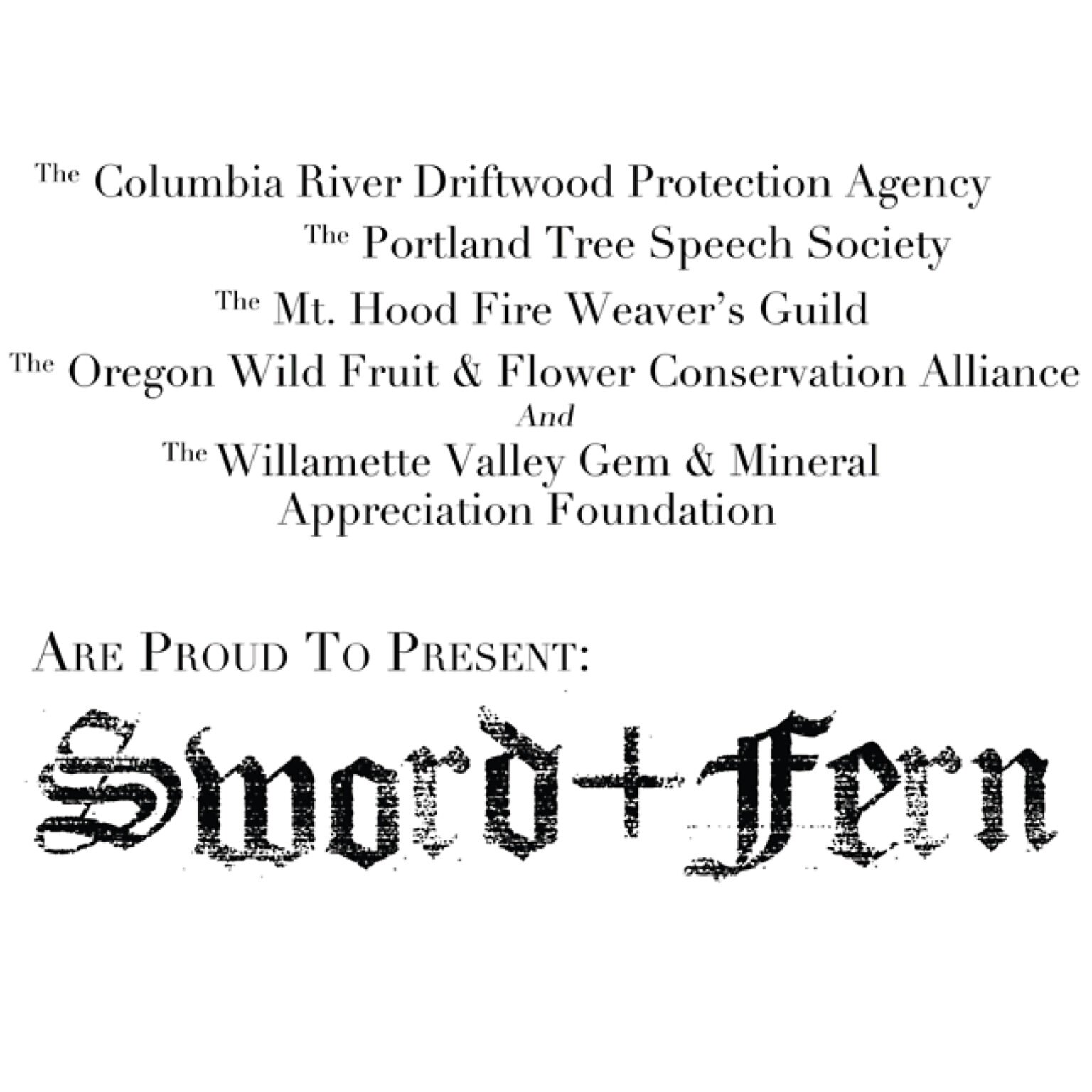
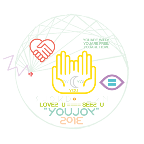
Execution: Designed an integrated visual ecosystem relying on precise visual hierarchies, unified typography systems, and custom brand photography that captures tactile, raw-material storytelling. By combining distinctive, old-world serif script typography with modern layouts and custom botanical and mythological linework motifs, this comprehensive framework preserved premium, artisanal integrity across print packaging, digital environments, and social media.













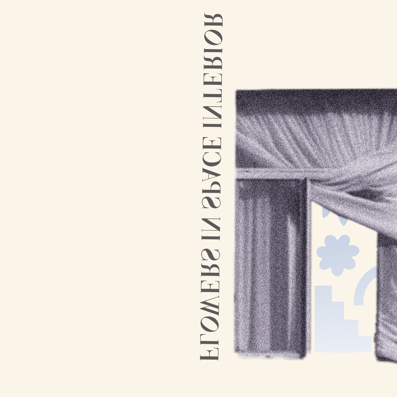
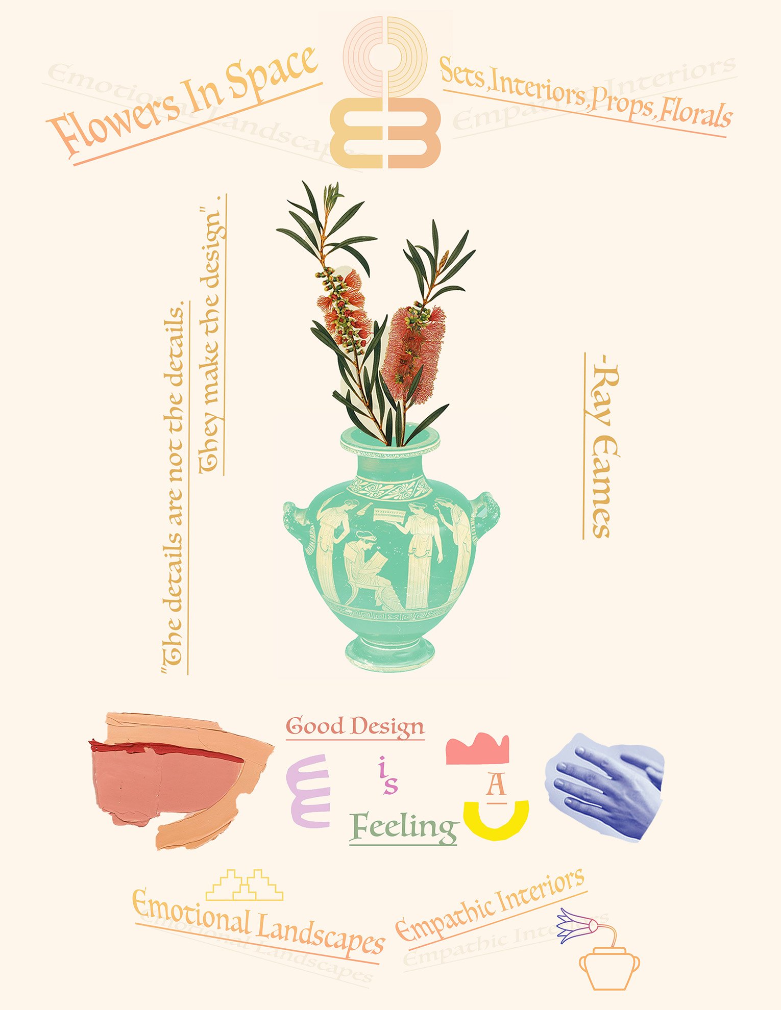
Case Study 4: Flowers in Space | Creative Direction & Design Studio
Strategic Focus: Directing a premier multidisciplinary creative studio that functioned as a strategic hub for high-level visual identity, holistic design systems, and bespoke environmental commercial film production.
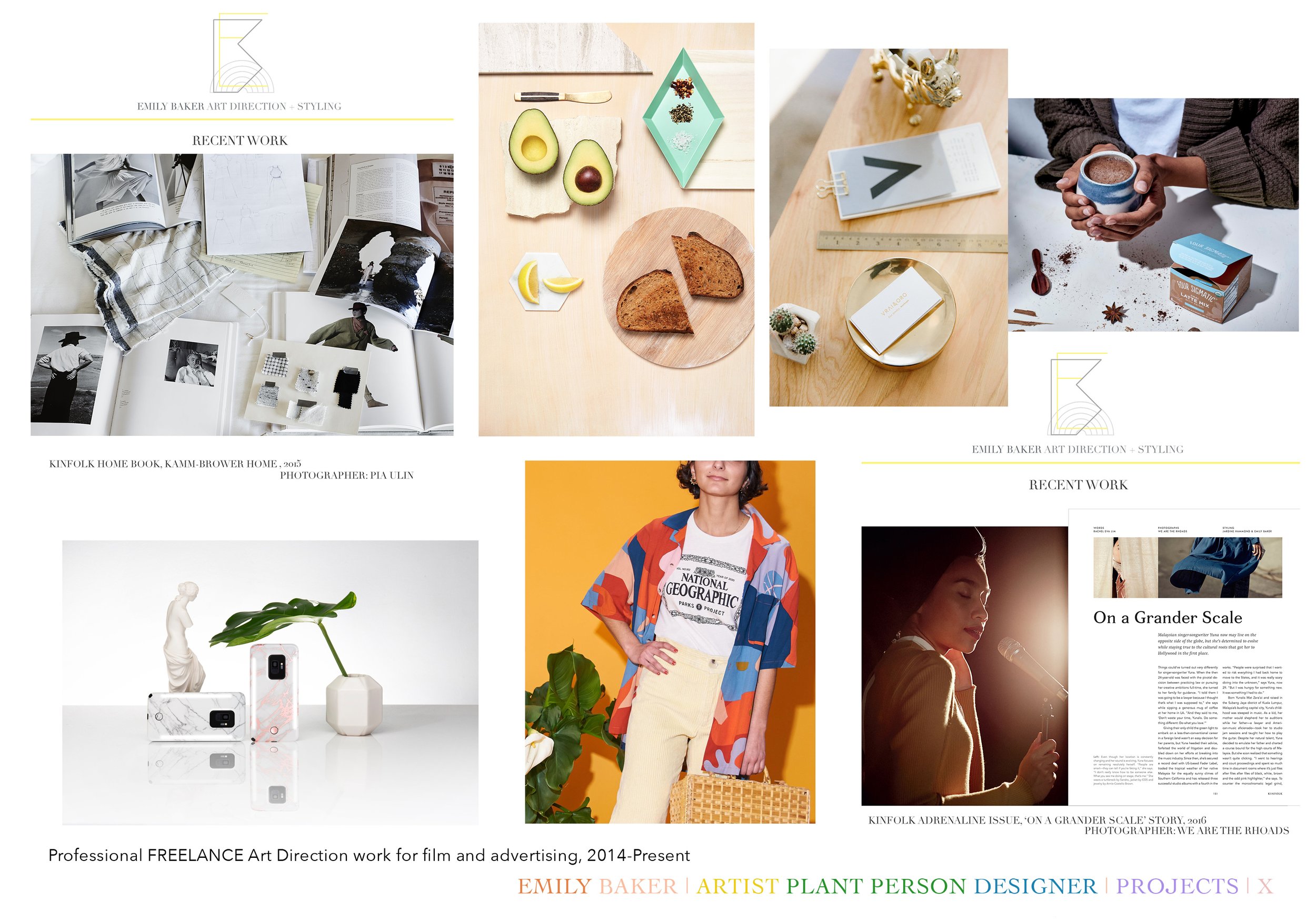
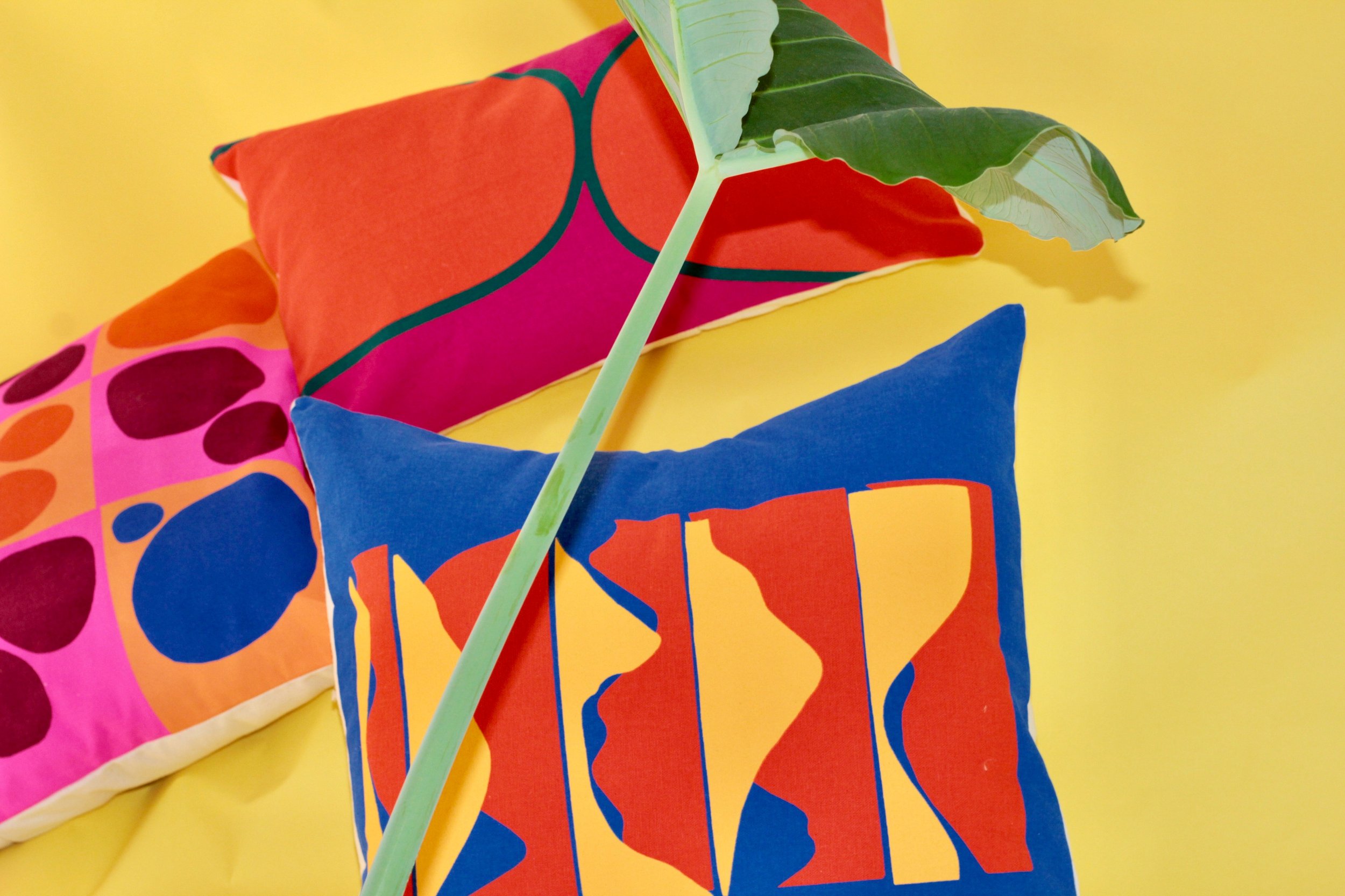
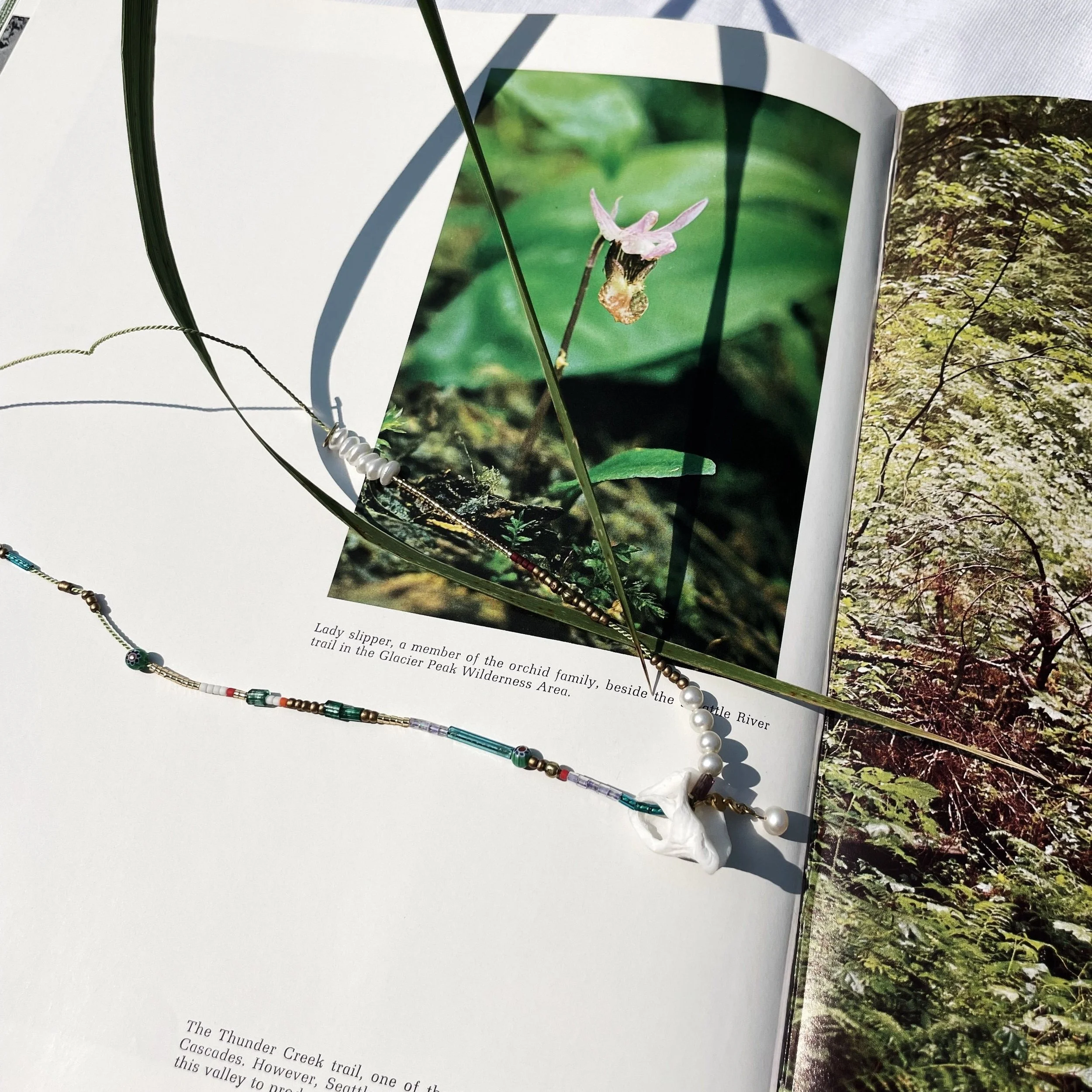
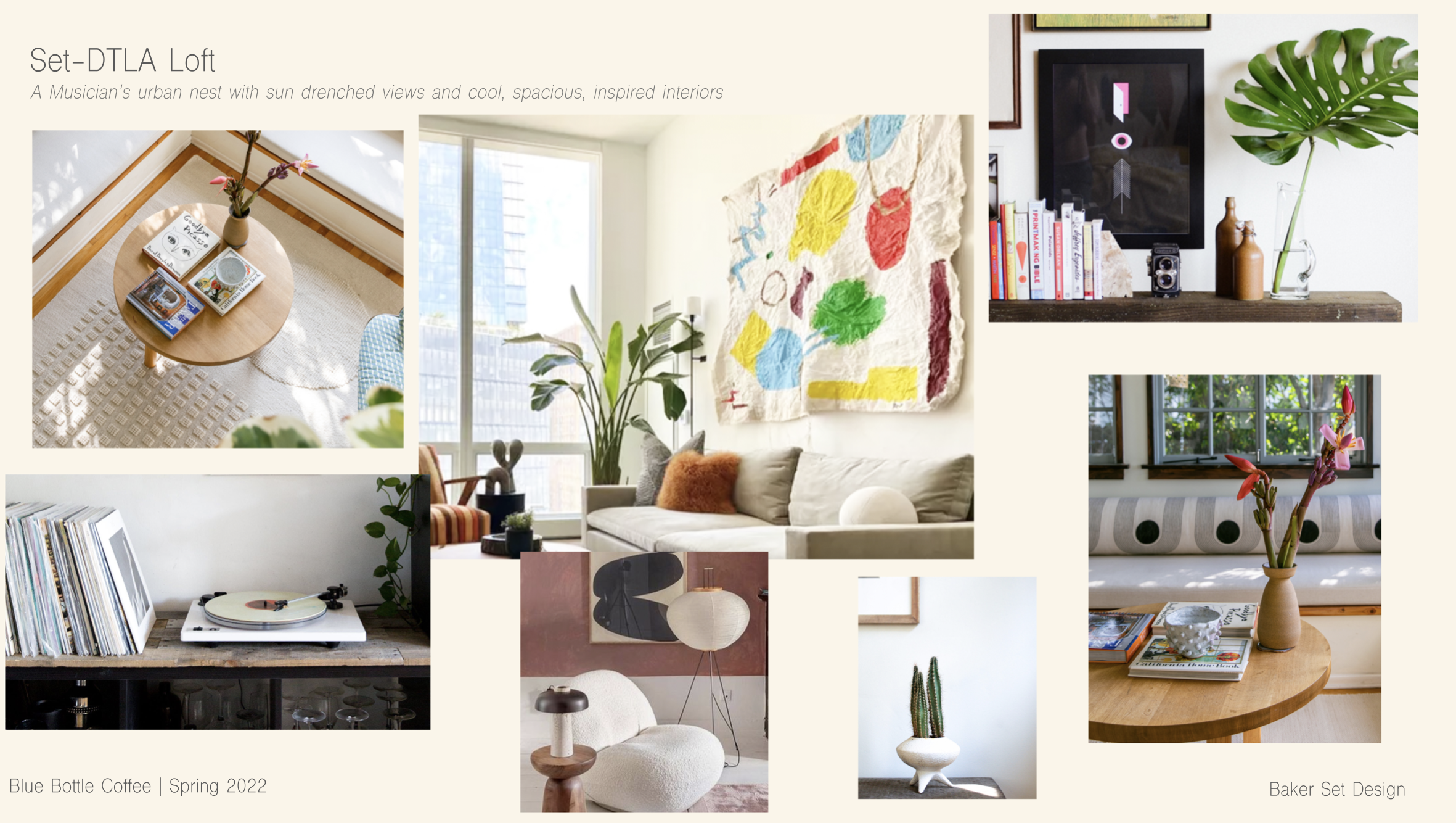
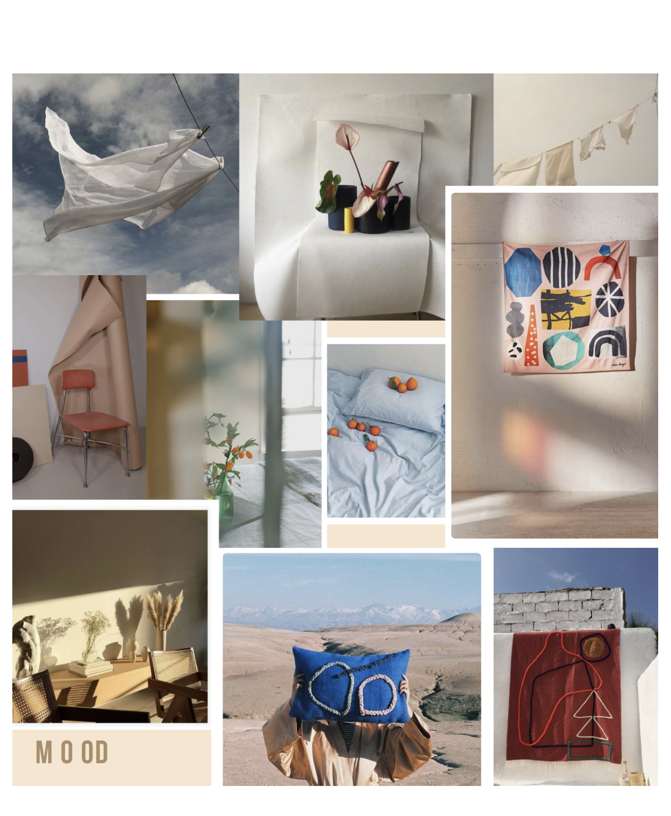
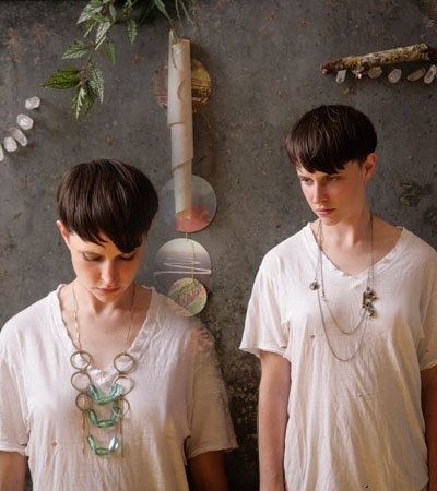
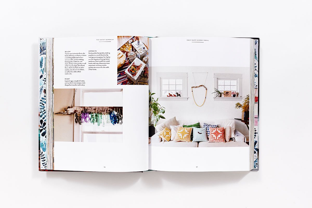
The Work: Founded and led the studio as Creative Principal, serving as the umbrella for comprehensive creative direction, design, and production workflows. Managed the end-to-end identity framework—from logo design and brand mood boards to digital layouts—while offering a boutique suite of professional photography, set-specific floral direction, and custom fine art curation. Earning widespread critical acclaim for its immersive, texture-rich environmental storytelling, the studio's unique design approach achieved global recognition, including a featured interior design chapter in Justina Blakeney’s 'The New Bohemians' book (2015) and a showcase in the Kindred Home book highlighting styling work.
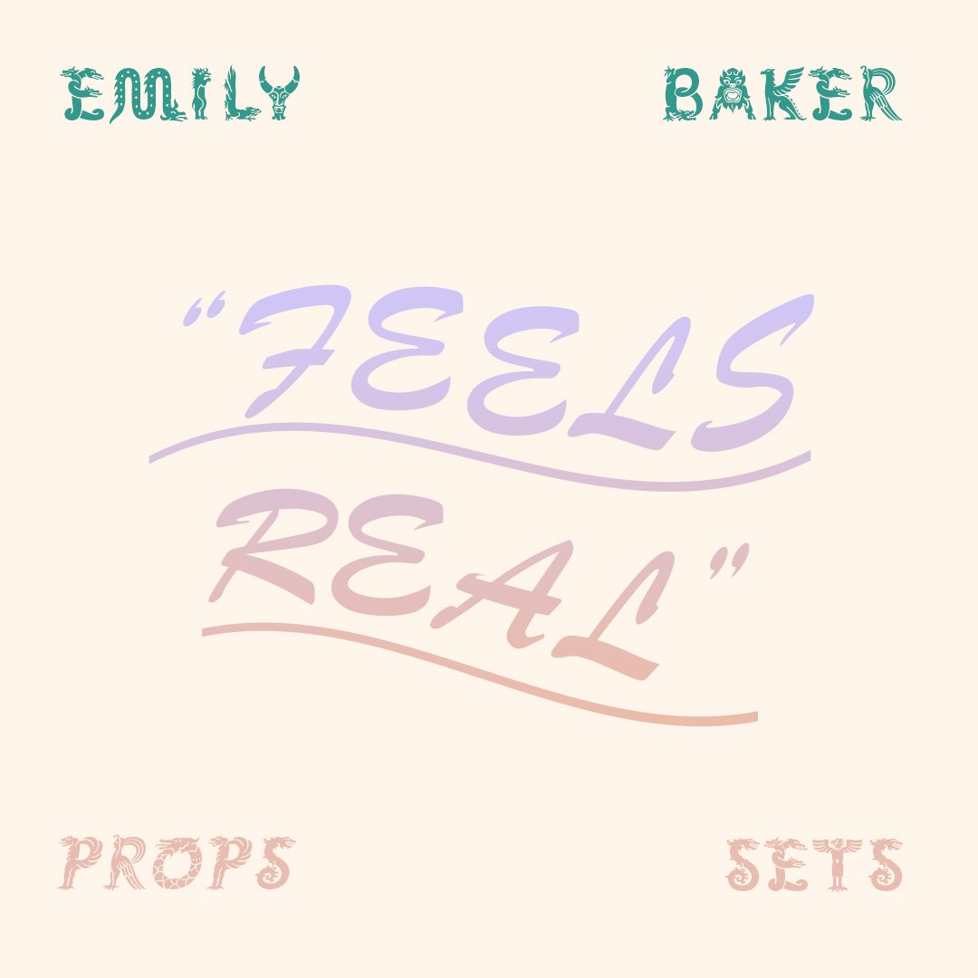
Execution: Integrated rigorous graphic design standards with bespoke artistic execution to build a singular, cohesive visual voice across every campaign touchpoint. Developed and produced original art pieces and custom botanical arrangements, while managing the procurement of fine art from local creators to cultivate elevated production environments. This holistic framework seamlessly blended physical space and digital architecture, ensuring a highly sophisticated, multi-dimensional public presence for diverse design-forward clients.










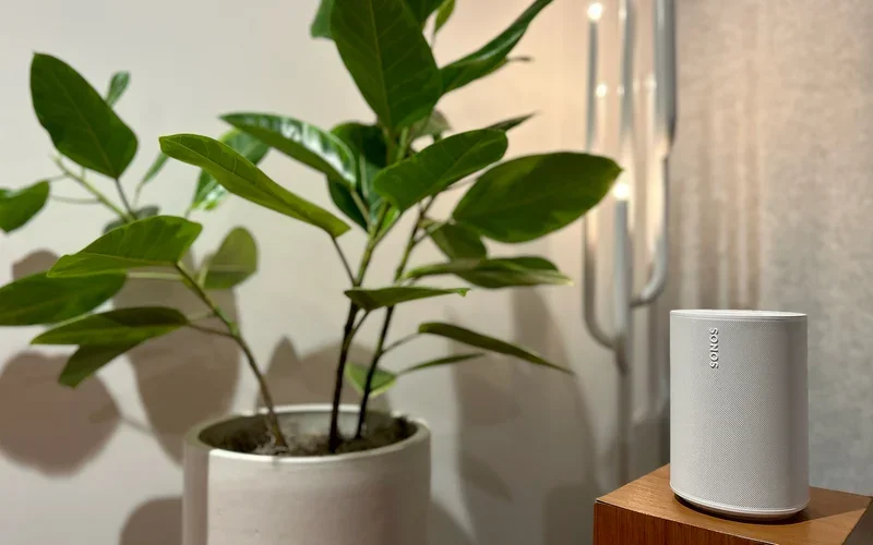
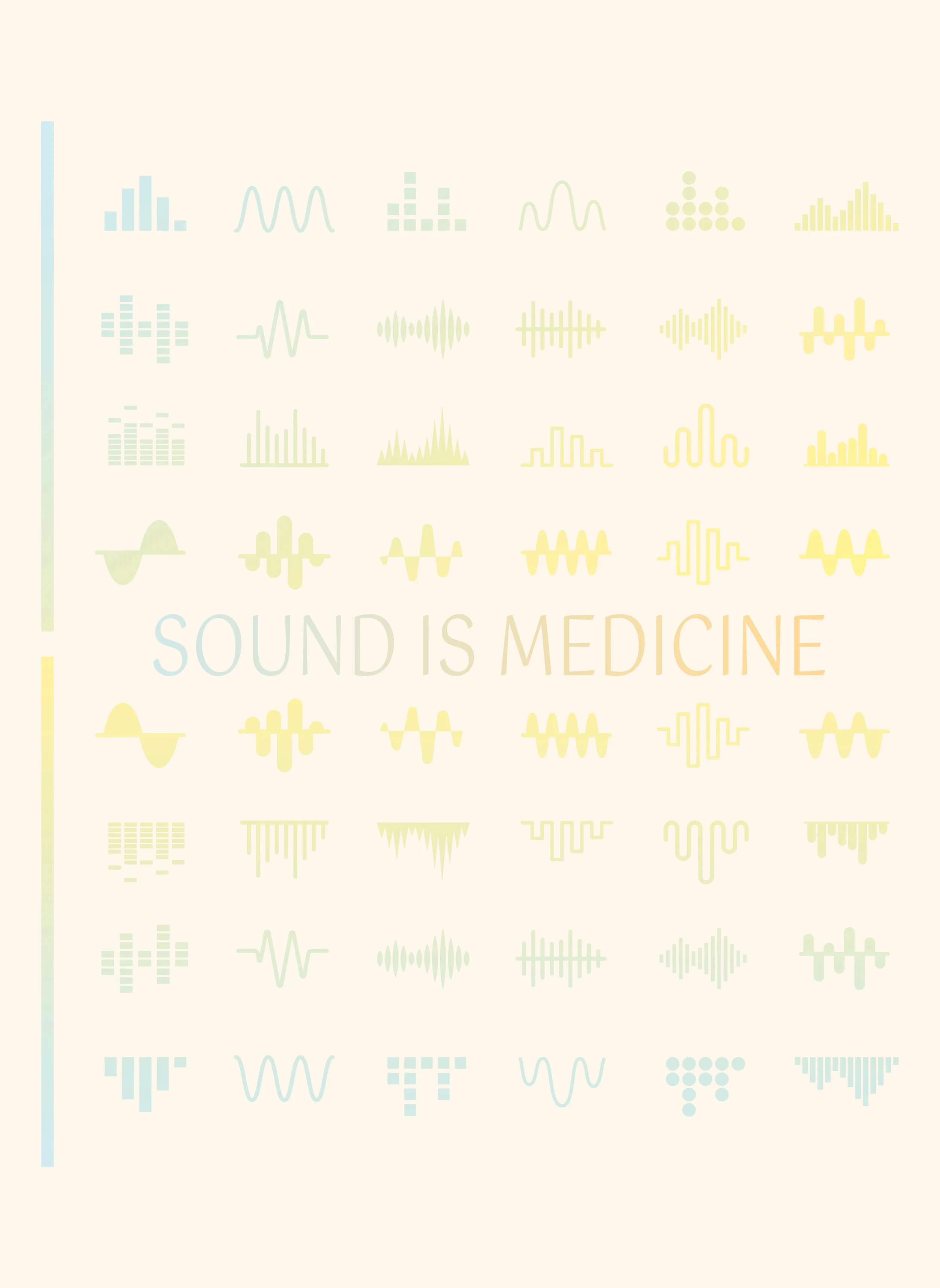
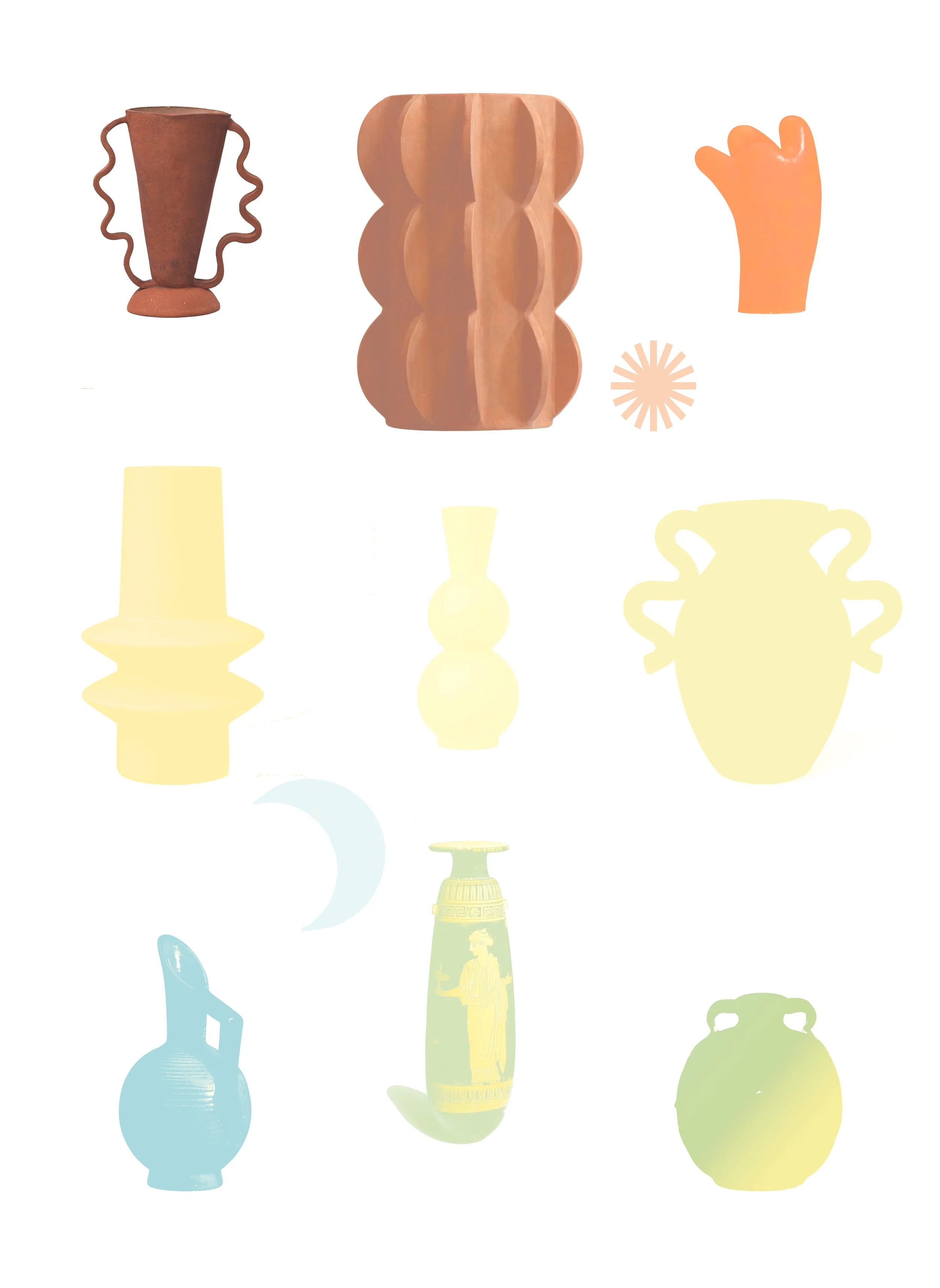
Case Study 5: Sonos | Photo Shoot Graphic Assets
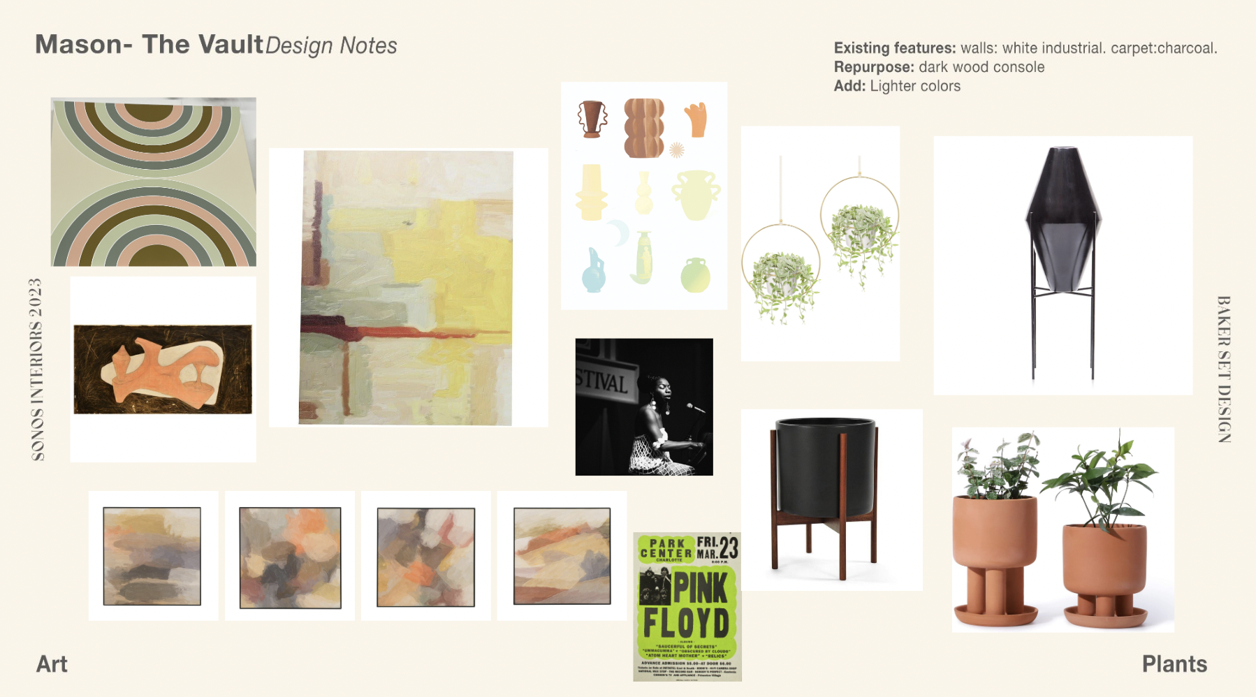
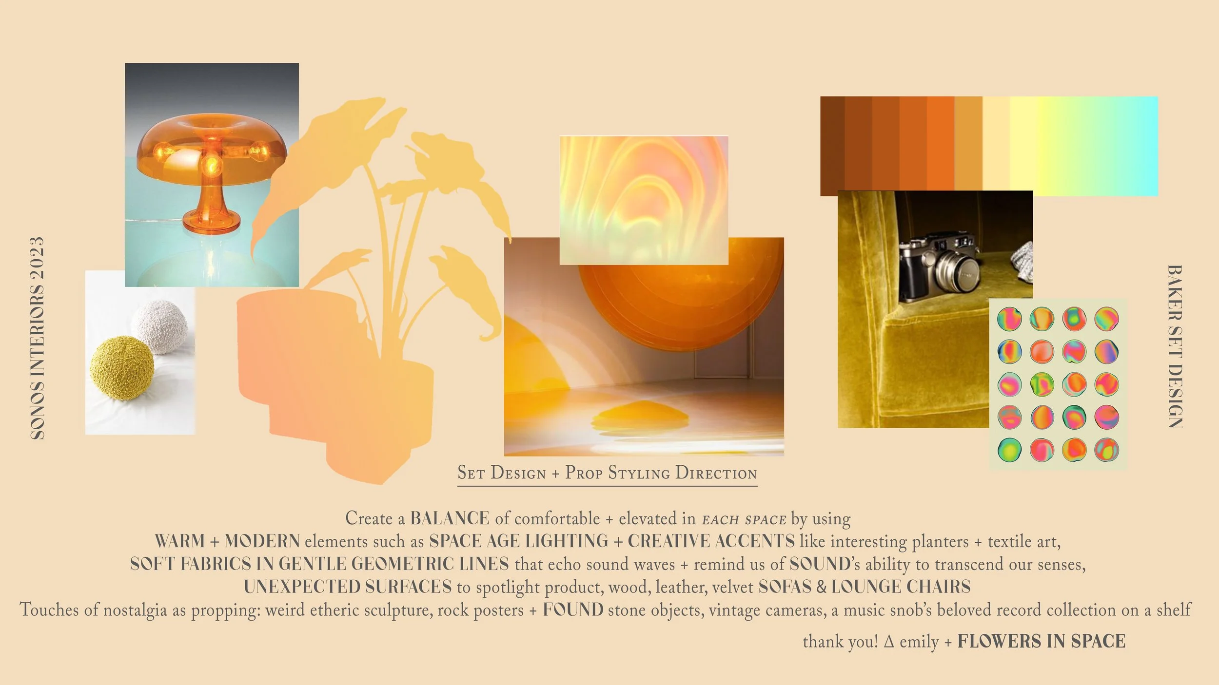
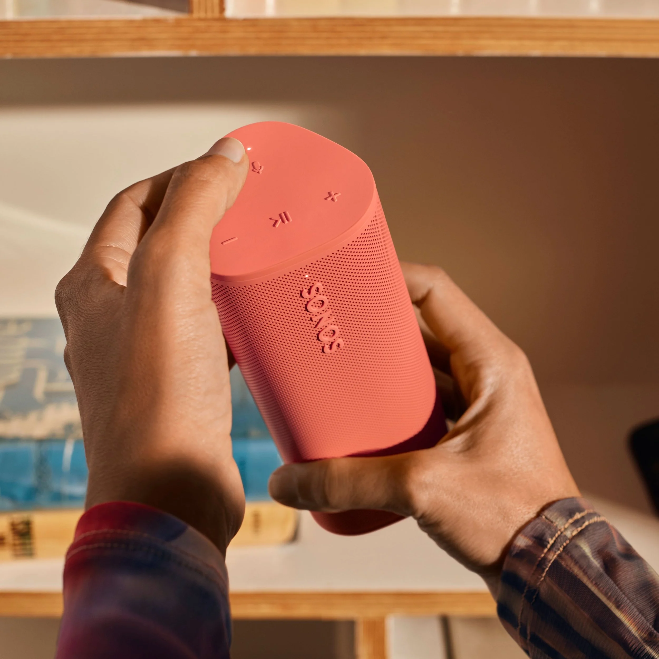
Strategic Focus: Designing high-concept, compliant graphic assets explicitly tailored for premium commercial photography environments.
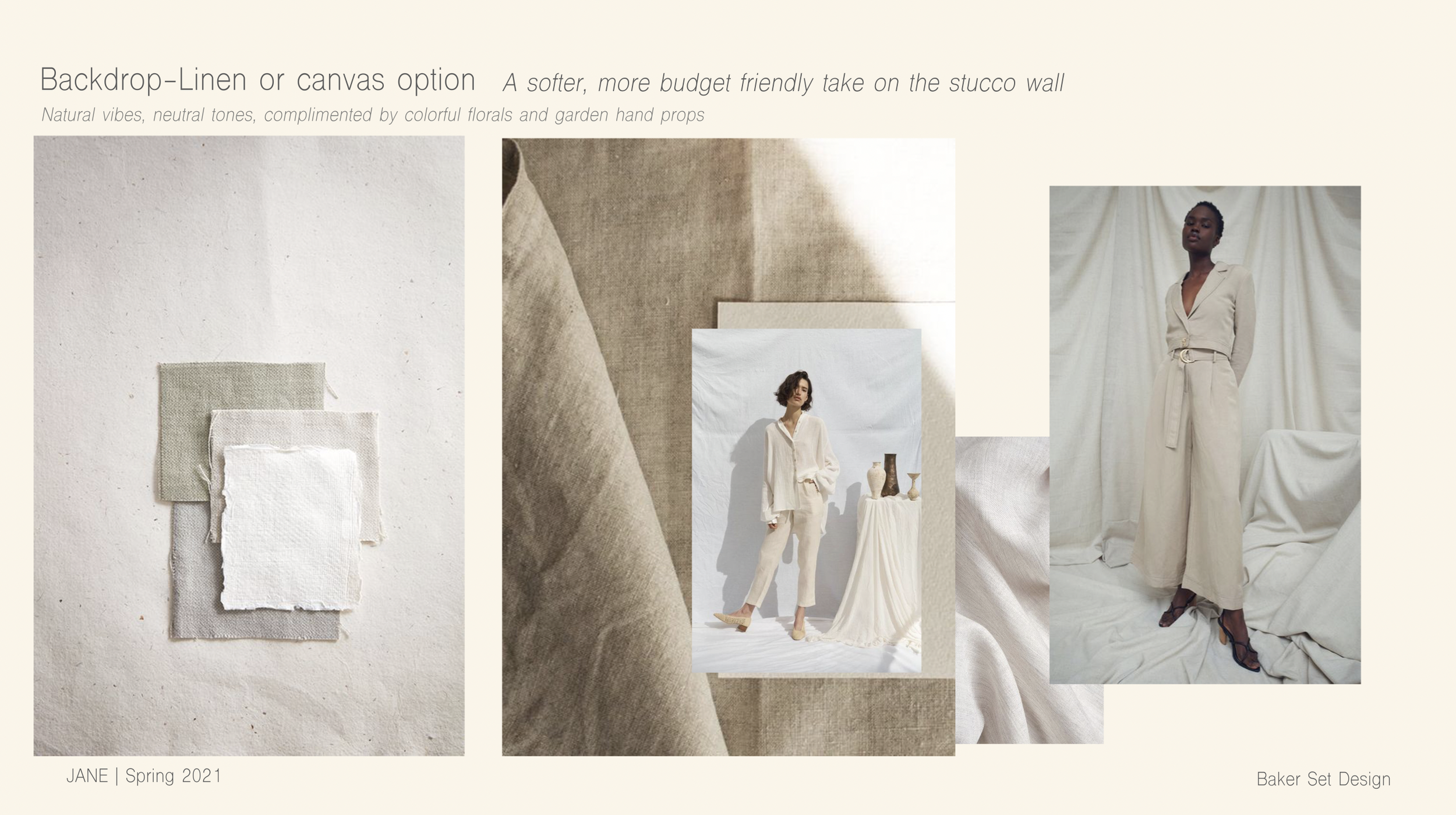
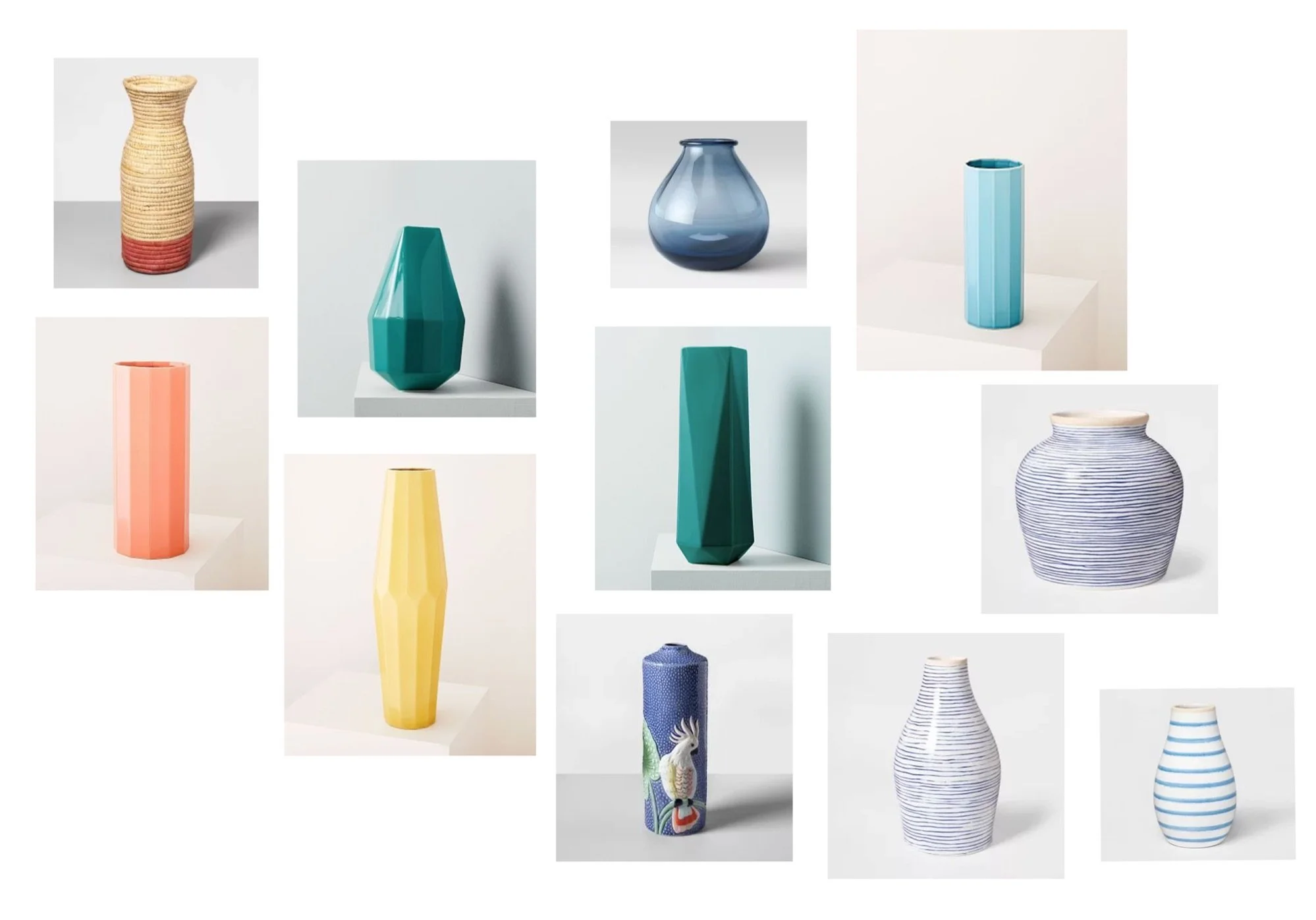
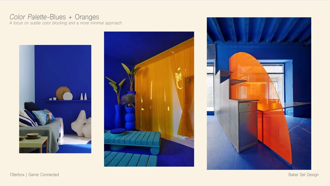
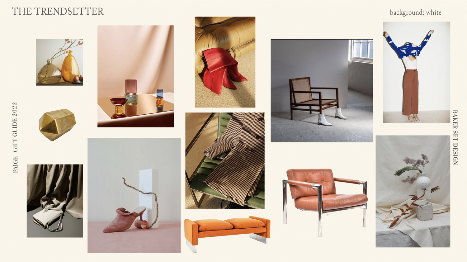
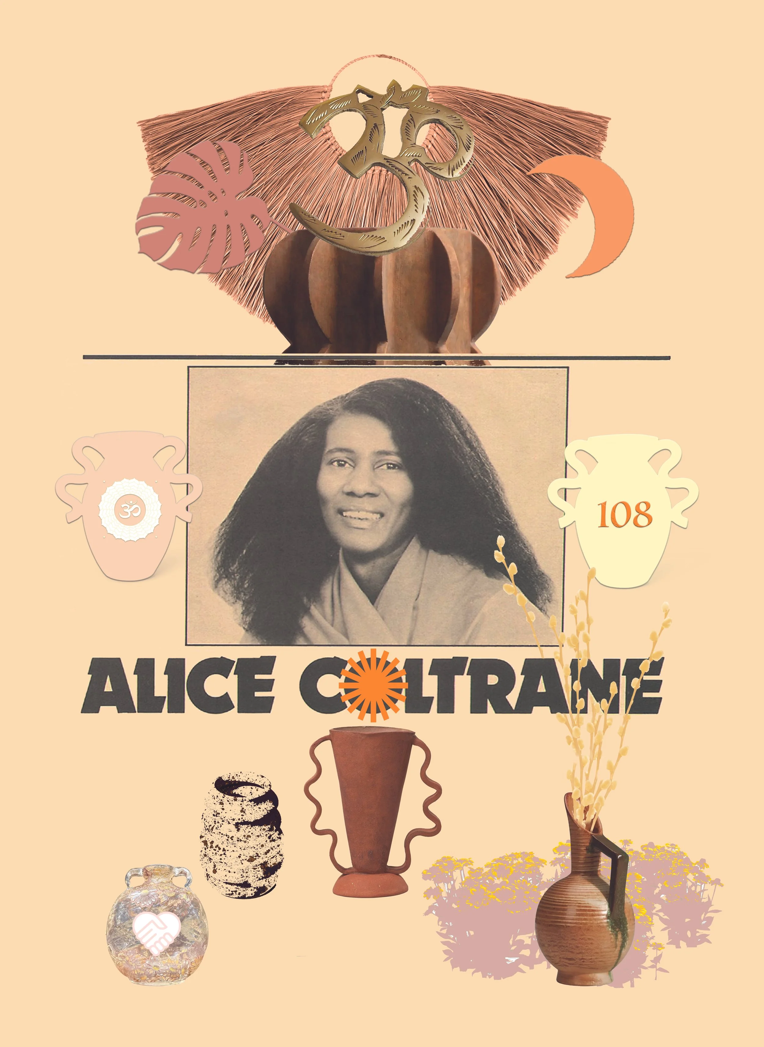
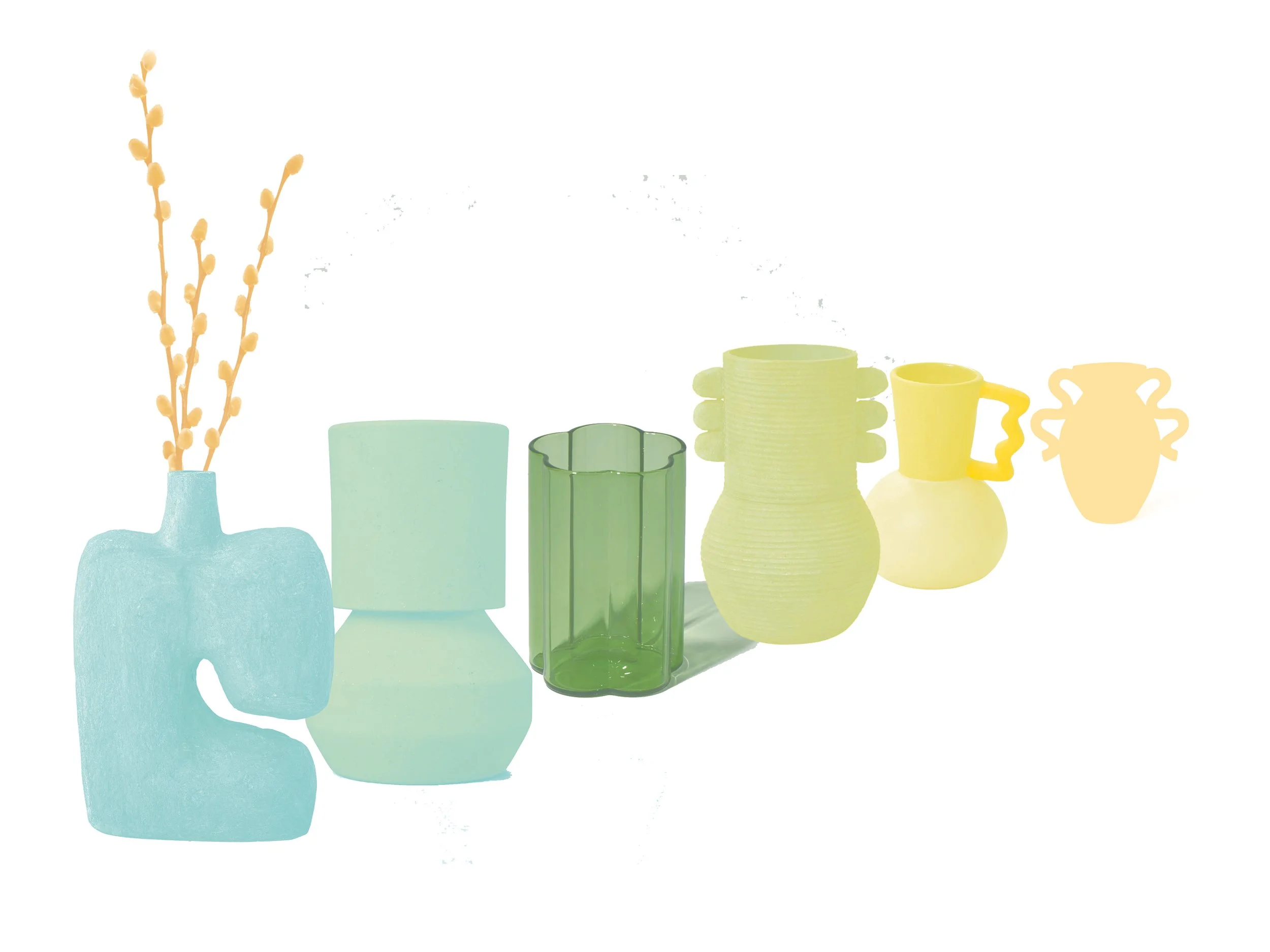
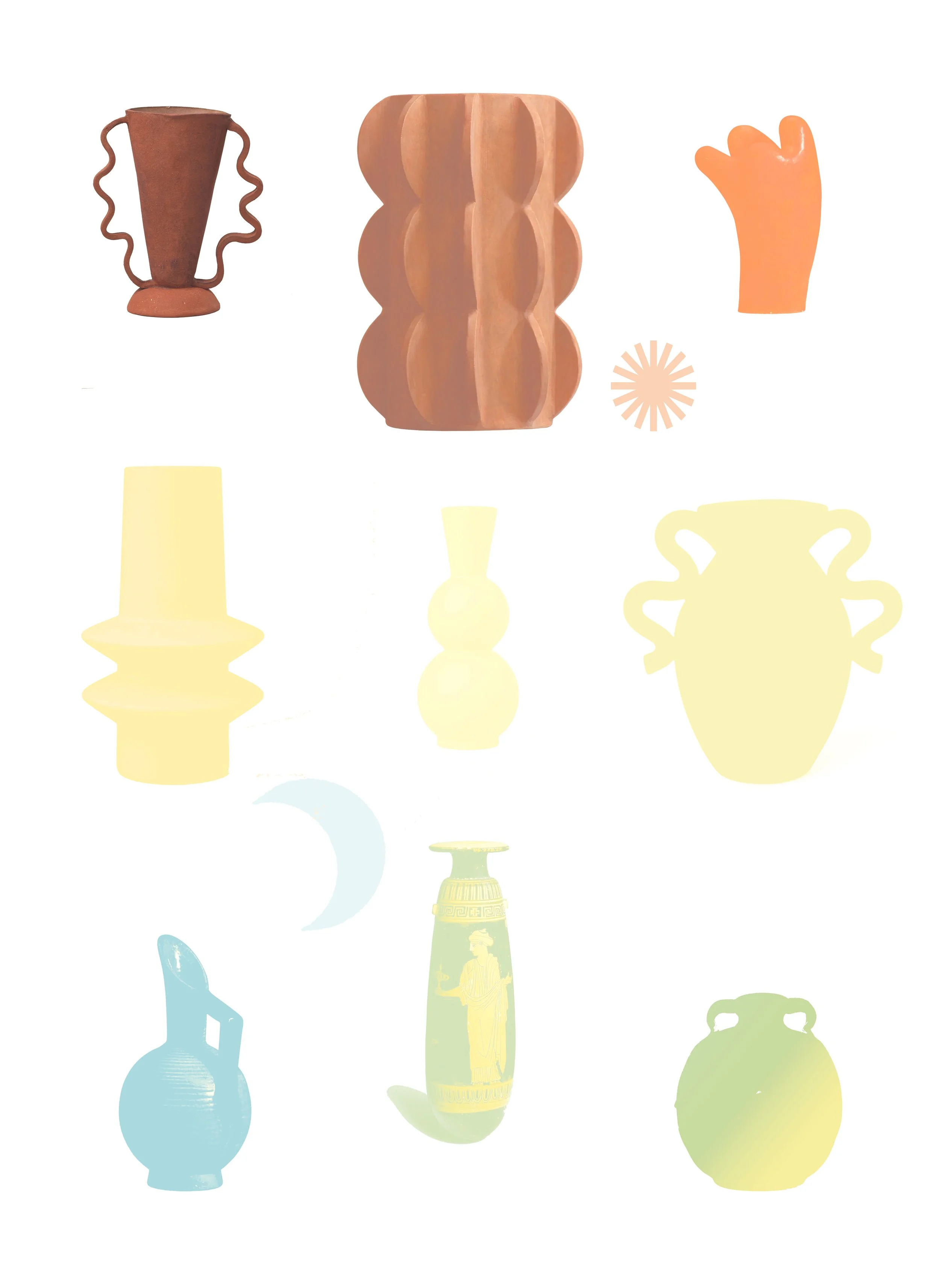
Execution: Created precise environmental graphic elements and design templates to be featured directly within professional photo shoots and demo environments, ensuring absolute alignment with global brand guidelines and visual storytelling standards.
Case Study 6: AT&T, HP | Production Design Graphics
Strategic Focus: Developing targeted graphic systems and asset layouts for commercial media production sets.
Execution: Designed on-set graphic elements and visual layouts optimized for photography and production settings, translating complex enterprise aesthetics into clean, impactful background environments.


Case Study 7: Midori Plantscapes | Heritage Brand Modernization
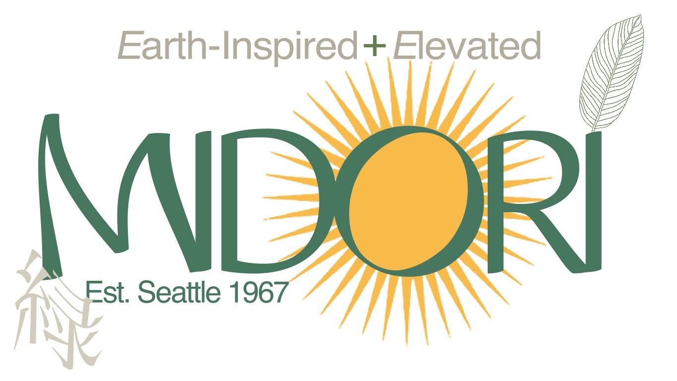
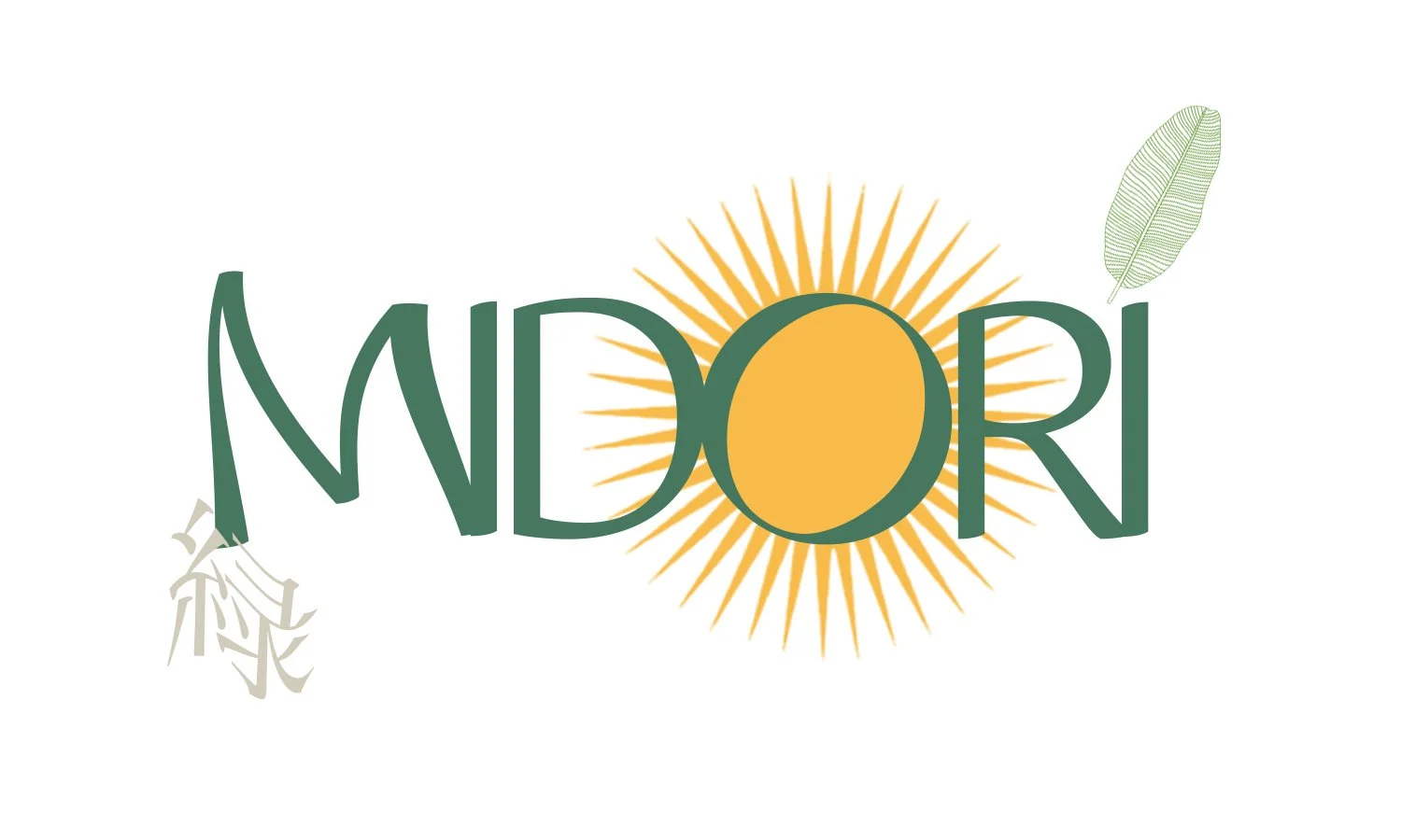
Strategic Focus: Concepting and executing a comprehensive multi-decade brand strategy refresh and modern horticultural identity for an established institution founded in 1967.
The Work: Directed the core identity update to gracefully bridge a historic Pacific Northwest legacy with a modern minimalist aesthetic tailored for high-end design environments. Designed an elevated, earth-inspired visual world that translates historical authority into a contemporary marketplace presence, ensuring the brand architecture balances structural tradition with progressive visual storytelling.
Execution: Designed a strategic visual framework combining sharp contemporary serif typography with intricate fine-line botanical illustrations. Built the omnichannel asset architecture and corporate layout systems, producing a comprehensive suite of deliverables that includes large-format digital business banners, clean web logotypes, cohesive color palette systems, and practical brand guidelines.


Case Study 8: California Association of Ayurvedic Medicine (CAAM)
Strategic Focus: International Conference Brand Architecture
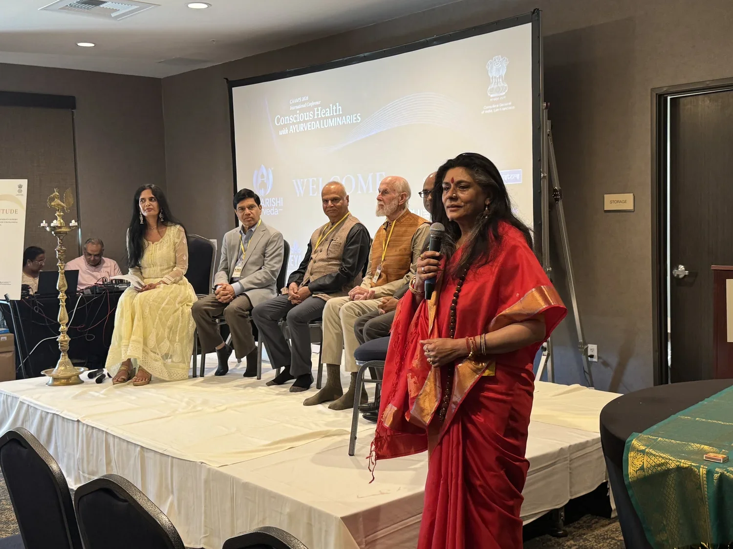
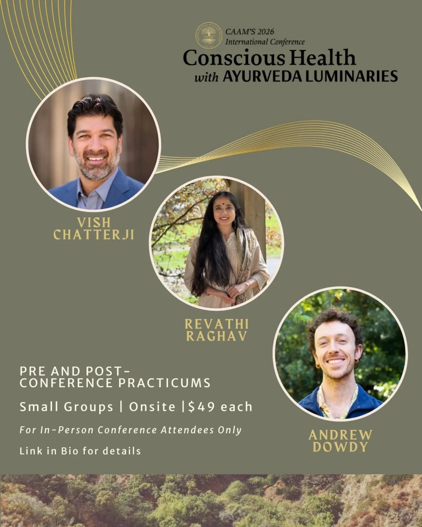
The Work: Conceptualized and executed the entire visual identity and brand guidelines for the 2026 international conference under the theme Luminary. Designed comprehensive visual systems to span all digital and print assets, including official web layout frameworks, digital banners, speaker systems, and social media marketing kits to elevate the organization's public presence.
Execution: Conference web layout design, speaker presentation systems, social media marketing assets, and print materials.